
Astra version 1.4.0 and above provides a feature to design Mobile Header separately for responsive devices.
It offers options to adjust Header Breakpoint, set different Logos, choose different Menu Styles, set Colors separately for the menu.
Note:
We have recently released the Header Footer builder in Astra version 3.0.0, due to which you will find some new changes. Please refer to the following article for the same.
Mobile Header Options with Astra Theme
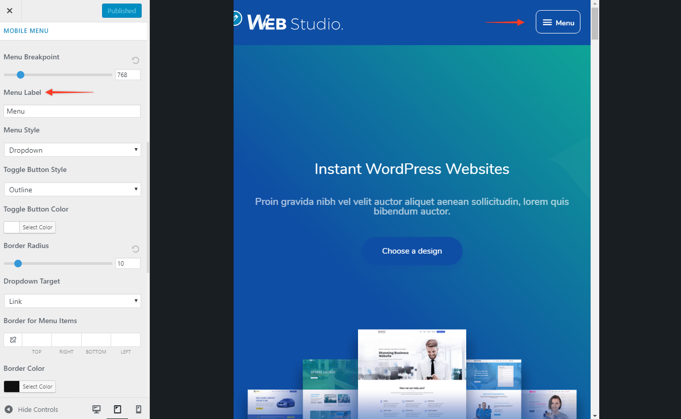
From your WordPress dashboard navigate to Appearance > Customize > Header > Primary Menu. Here, scroll down to the “Mobile Menu” section which contains mobile header settings listed under several different tabs:
Menu Breakpoint
The setting can be found under Header > Primary Menu > MOBILE MENU
The default menu breakpoint for Astra is 921px. It can be changed easily with the slider.
For example – If a breakpoint is set to 554px then the desktop header will be visible till 554px width and it will change to a mobile header below 554px.
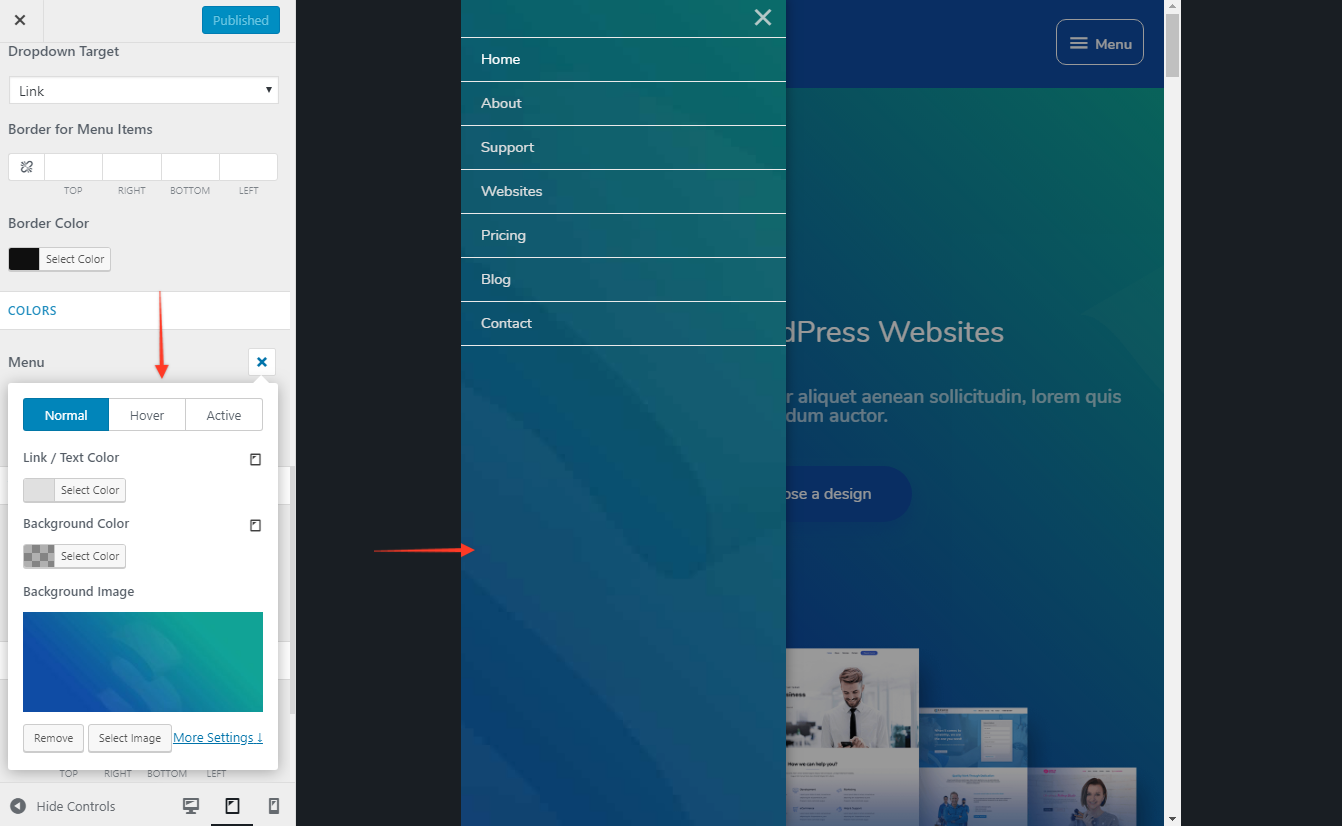
Dropdown Target
This will allow you to set a target to open a submenu in the mobile header. It has two options – Icon and Link.
If you choose Icon, the submenu dropdown will open with the click of a small arrow icon beside the menu item name.
And if you choose Link, the submenu dropdown will open with the click of an entire menu item (link).
Toggle Button Style, Toggle Button Color, and Border Radius
Settings can be found under Layout > Header > Primary Menu > MOBILE HEADER.
Style the toggle button with these settings. (?)
Menu Label on Small Devices
The setting can be found under Layout > Header > Primary Menu > MOBILE HEADER.
It allows adding a label to the toggle button and highlight it. (?)
Mobile Header Alignment
It allows choosing the alignment of logo and menu on devices below breakpoint. (?)
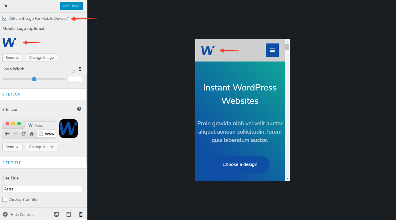
Logo (optional)
The desktop screens often require a larger logo than mobile screens. At the same time, this large logo might hide the big part of the viewport on mobile. Also, there might be differences between desktop and mobile headers that would require a different logo (color, type, size, etc.). Thus, there is a separate option for adding a different logo for mobile devices.
You can set this under Layout > Header > Site Identity. Choose option Different Logo for mobile devices? and add a mobile device logo image here. (?)
To adjust the size for the logo click on the responsive toggle button for Logo Width and adjust the width.
Mobile Header Options with Astra Pro
The Mobile Header module from Astra Pro adds more options to the layout along with Colors & Background options.
Mobile Header is a premium feature available with the Astra Pro Addon plugin. To use these Pro features, you need to have the Astra theme along with the Astra Pro Addon installed on your website.
Quick Steps to Manage a Mobile Header Using the Mobile Header Module
Step 1: Make sure you have the Astra Pro Addon plugin installed and activated. How to Install Astra Pro Addon plugin?
Step 2: Activate the module from the Astra Options under the WordPress Dashboard > Appearance > Astra Options
Step 3: Visit customizer [ Appearance > Customize > Header > Primary Menu > MOBILE HEADER ] to edit module settings
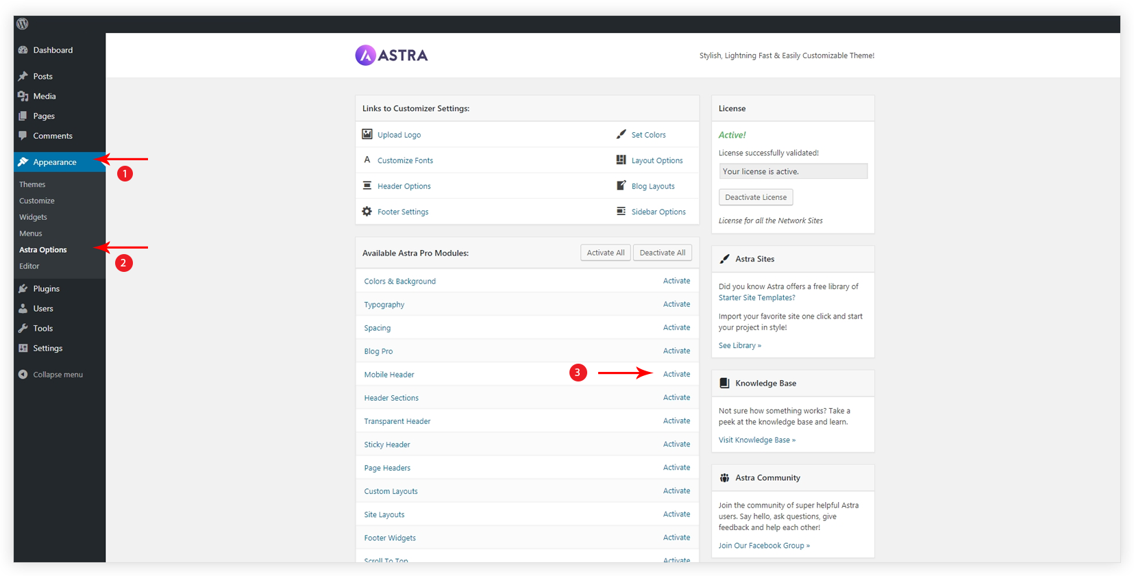
Activate the module from the dashboard under Appearance > Astra Options > Mobile Header. After activating the module additional options will be added under Appearance > Customize > Header > Primary Menu > MOBILE HEADER.
Menu Style
Choose a style for the menu which appears with the click of the toggle button.
- Dropdown will be simply a list of menu items that will appear on clicking the menu toggle button.
- Flyout style will allow the menu to slide from either end of the screen.
- Full-Screen style will cover the whole screen and display menu item in the middle.
- No Toggle style will not display the menu inside the hamburger menu on responsive devices. The menu will appear same as desktop.
Border for Menu Items
It will apply a border around each menu item. Set width to the border and then apply color.
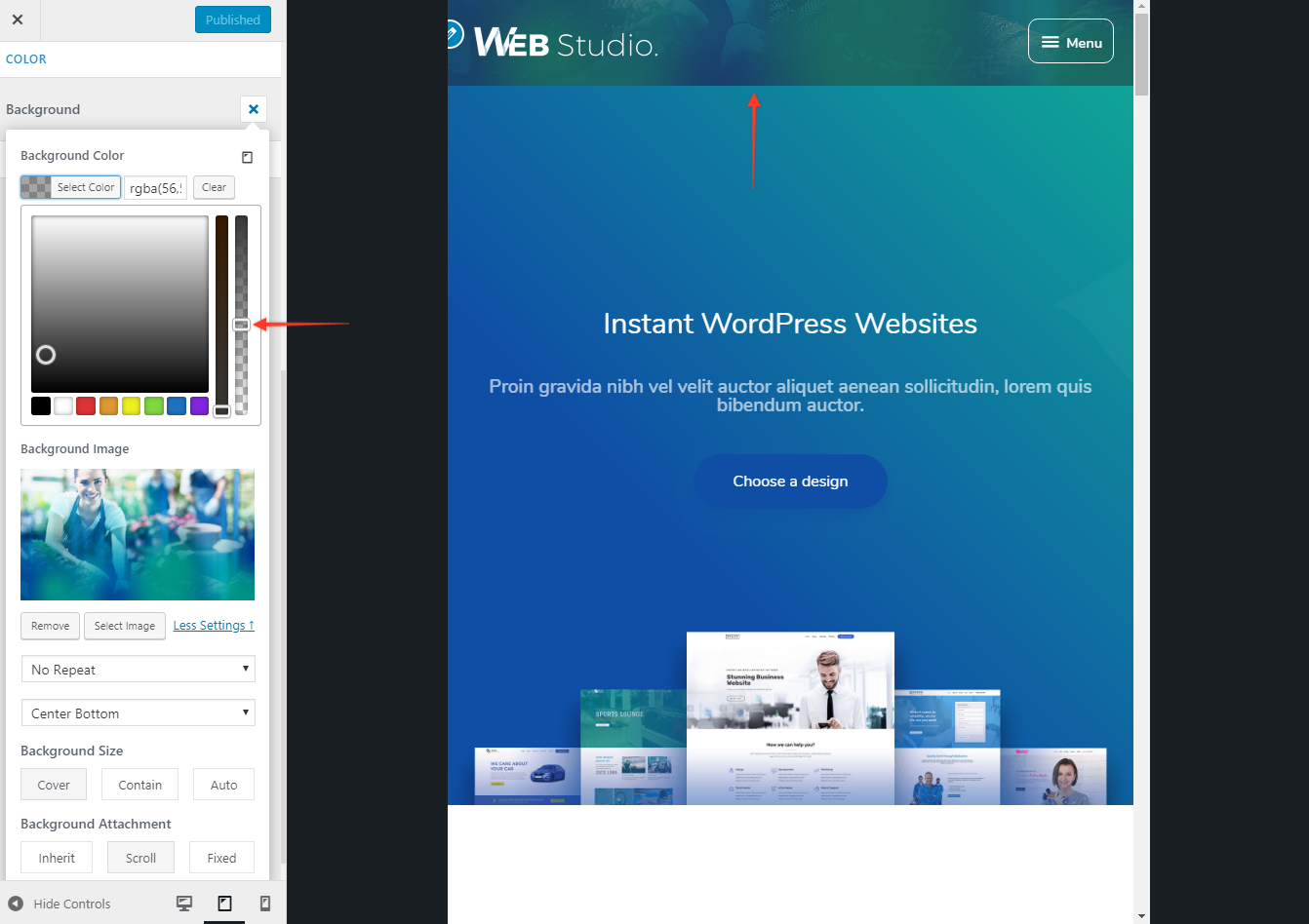
Colors & Background for Mobile Header
The colors & Background module from Astra Pro provides more Colors & Background options for Mobile Header.
You would need to activate Colors & Background and Mobile Header modules from Appearance > Astra Options.
Settings can be found under Appearance > Customize > Header > Primary Menu.
Click on the responsive toggle button and set the colors and background for the Mobile Header.
Background
Set Background Color for Mobile Header or set Background Image and adjust the opacity. (?)
Primary Menu and Submenu
If either of the Menu Style – Flyout or Full-Screen is selected, you can set the background image and overlay color for a menu with the Primary Menu background image. (?)


