
Note:
For users of the new Header Footer Builder post Astra 3.0.0, the breakpoint option will not appear. To adjust the breakpoint, update the tablet breakpoint as stated in this article.
Astra offers an option to change the Menu Breakpoint for Mobile Header at Layout > Header > Primary header > Mobile header.
A menu breakpoint is like a special line for your website’s menu design. It’s the point where the menu layout changes to fit different screen sizes.
For example, on a computer screen, you might see a full menu with many options, but on a small phone screen, it might switch to a simple menu icon. Web designers set these breakpoints so that the menu looks good on every device.
When you increase this breakpoint, a transparent menu color does not work on devices with a width from 768px to the Menu Breakpoint width.

To fix this add the following code to the child theme’s functions.php file.
/**
* Function to disable the transparent header below 800px screen
*
* @return void
*/
function disable_transparent_header_mobile() {
    ?>
    <script type="text/javascript" >
    jQuery(window).on('resize', function(){
        if ( '800' >= jQuery( window ).width() ) {
            if ( jQuery( 'body' ).hasClass( 'ast-theme-transparent-header' ) ) {
                jQuery( 'body' ).removeClass( 'ast-theme-transparent-header' );
            }
        } else {
            if ( !jQuery( 'body' ).hasClass( 'ast-theme-transparent-header' ) ) {
                jQuery( 'body' ).addClass( 'ast-theme-transparent-header' );
            }
        }
    });
    jQuery( document ).ready(function() {
        if ( '800' >= jQuery( window ).width() ) {
            if ( jQuery( 'body' ).hasClass( 'ast-theme-transparent-header' ) ) {
                jQuery( 'body' ).removeClass( 'ast-theme-transparent-header' );
            }
        } else {
            if ( !jQuery( 'body' ).hasClass( 'ast-theme-transparent-header' ) ) {
                jQuery( 'body' ).addClass( 'ast-theme-transparent-header' );
            }
        }
    });
    </script>
    <?php
}

add_action( 'wp_footer', 'disable_transparent_header_mobile' );
Please replace 800 with the Menu Breakpoint width you set up in the customizer.
Note: We recommend only adding this code to your child theme for compatibility with future updates.
Here’s how you can do it:
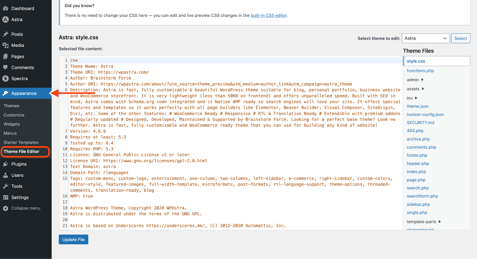
- Go to your WordPress dashboard and navigate to Appearance > Theme File Editor.
- Access your functions.php file from the right and add the above code towards the end.
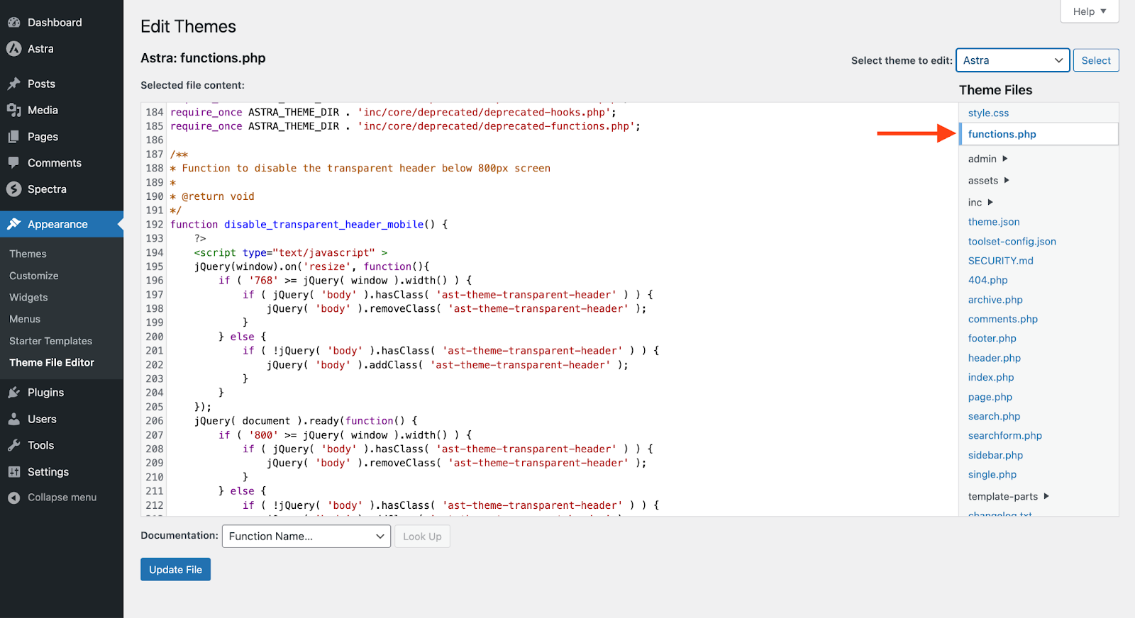
- Click on the Update File button to save your changes.
That’s it! The transparent menu color should be working as expected now. If not, please contact our support team. We’re always here to assist you whenever needed!
