
The importance of mobile devices, though already enormous it’s getting higher still. Thus, when designing your website, it’s essential that your design is responsive and stays consistent on all screen sizes. This document will help you use the Astra Theme built-in responsive editing options.
With these options, you can adjust settings throughout your website so it looks perfect on Desktop, Tablet, and Mobile.
Responsive Editing
Having that the difference between desktop and mobile phone screens is quite big, it is very hard (almost impossible) to create a single website design that will look perfect on both and all screen sizes in between. This is why you must design your websites to be responsive.
Responsive editing means that you need to modify your website design separately for desktop, tablet, and mobile to make it look equally good on all of these screens. Mostly, your website content is added using Page Builders, and all of them are equipped with responsive editing options.
You will be able to do the same for the most of the theme-related settings as Astra comes with these options built-in. In addition, It’s easy to know which options can have responsive editing enabled as you will see a responsive editing icon next to them.
Previews
When your website is responsive, the browser will display different designs following the breakpoints. The breakpoint is the specific screen width, set to serve as a point which the browser uses to distinguish desktop, tablet, and mobile screens.
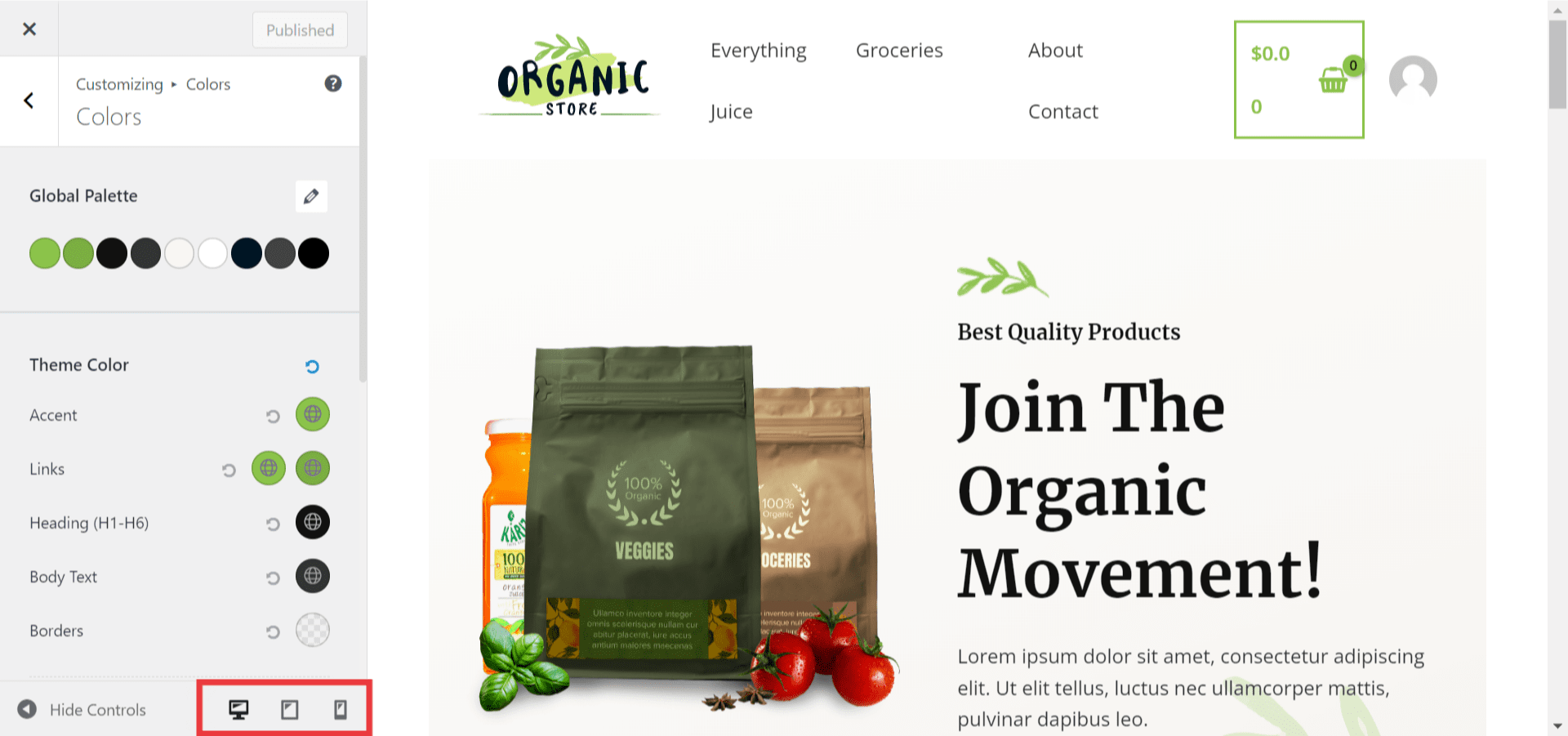
You can switch between Desktop, Tablet, and Mobile preview to edit and preview your website design on different devices. To do this, you can use the responsive editing icon:
Step 1 – Navigate to the setting that you want to edit. Look for the responsive editing icon next to it;
Step 2 – Click on the icon to circle between desktop, tablet, and mobile device settings – choose the preview you need to edit.

Alternatively, you can change the preview by using the default buttons at the bottom of the Customizer.
Size Units
The important factor in responsive design is the size unit being used, as each unit reacts differently to changing the screen size.
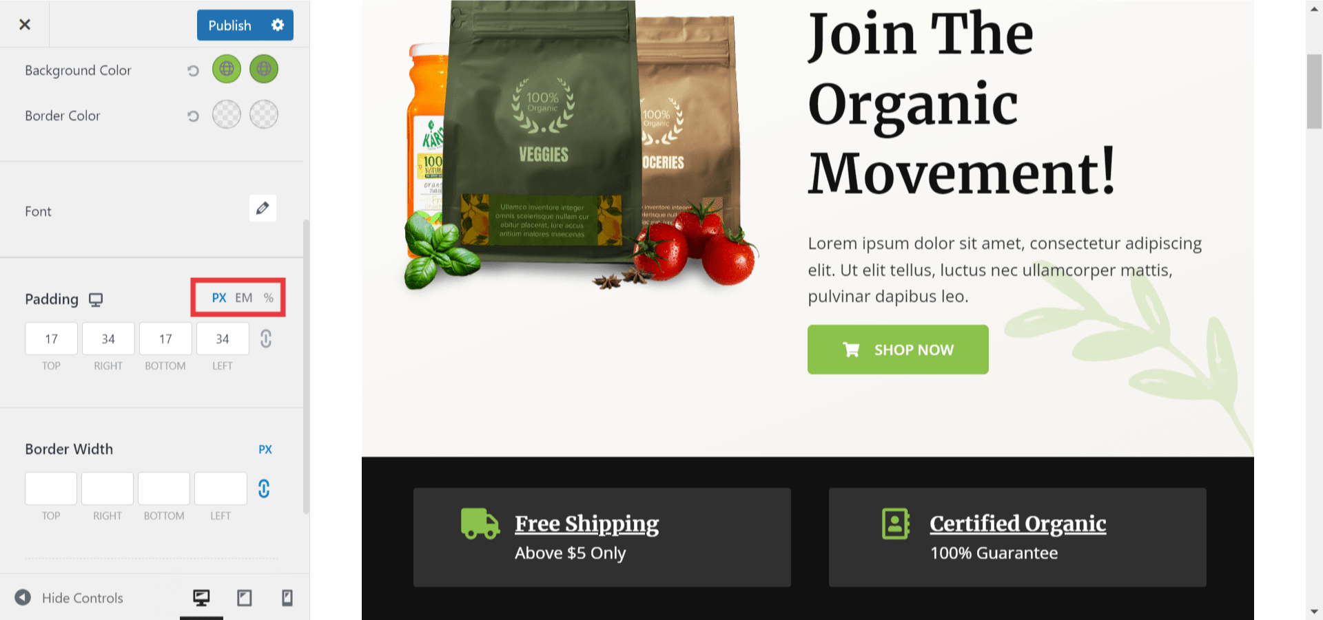
There are three available units: PX, EM, and %. So what is the difference between these three?
- The pixels (PX) are often used for their precision. Having that 1px is a relatively small unit, you can easily adjust the size just as you imagined. Also, it’s an absolute unit, meaning that it always appears precisely the same and is not influenced by other website elements. For example, a margin set to 20px will always take this same space on any element.
On the contrary, both EM and percentage (%) are relative units. This means that they change depending on their parent elements (like body, header, footer, sections, rows, columns, widgets/blocks, etc.):
- EM is a unit relative to the parent element font size. For example, if you set your heading (parent element) font size to 20 px, setting spacing of 1 em for that heading will be equal to 20 pixels. Changing the font size will change the spacing automatically.
- A percentage (%) is a unit relative to the parent. This means if you set your logo (parent element) width to 150 px, setting the 20% margin will add spacing of 30px. Thus, If you change the width of your logo, the spacing will adjust proportionally.
It’s important to mention that some Customizer options are using only a specific size unit. Accordingly, these options don’t have the possibility of choosing the size unit.
Responsive Settings With Astra Customizer
Responsive settings are available in almost all Customizer options (only Sidebar and Performance options have no responsive settings). These are the types of settings that you could use with the responsive editing capability:
- Font Size & Colors
- Border Color
- Icon Size, Color, and Spacing
- Background Colors, Overlays, and Images
- Paddings
- Margins
- Alignments
How To Do This?
You can add responsive edits to the Astra Customizer options, by following these general steps:
Step 1 – Access the Customizer. When accessing the Customizer, it will be by default set to the desktop preview;
Step 2 – Navigate to the location of the option you wish to edit;
Step 3 – Using the responsive editing icon next to the settings, circle between the desktop, tablet, and mobile preview to select the one you wish to edit. We would suggest starting from the desktop as some settings could be automatically inherited by smaller viewport sizes (for example, font or background colors);
Step 4 – Edit your settings separately for desktop, tablet, and mobile. Click “Publish” to apply changes.
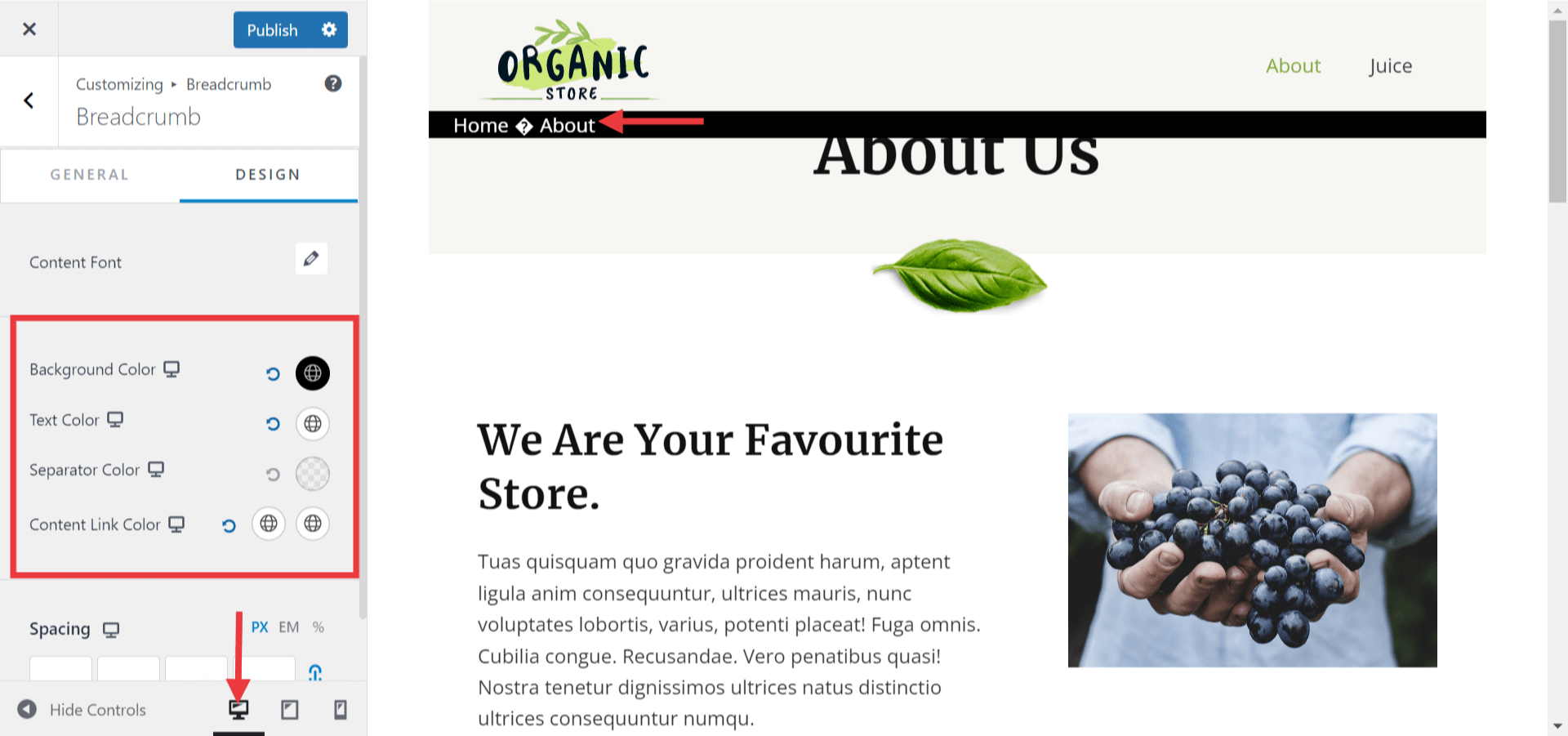
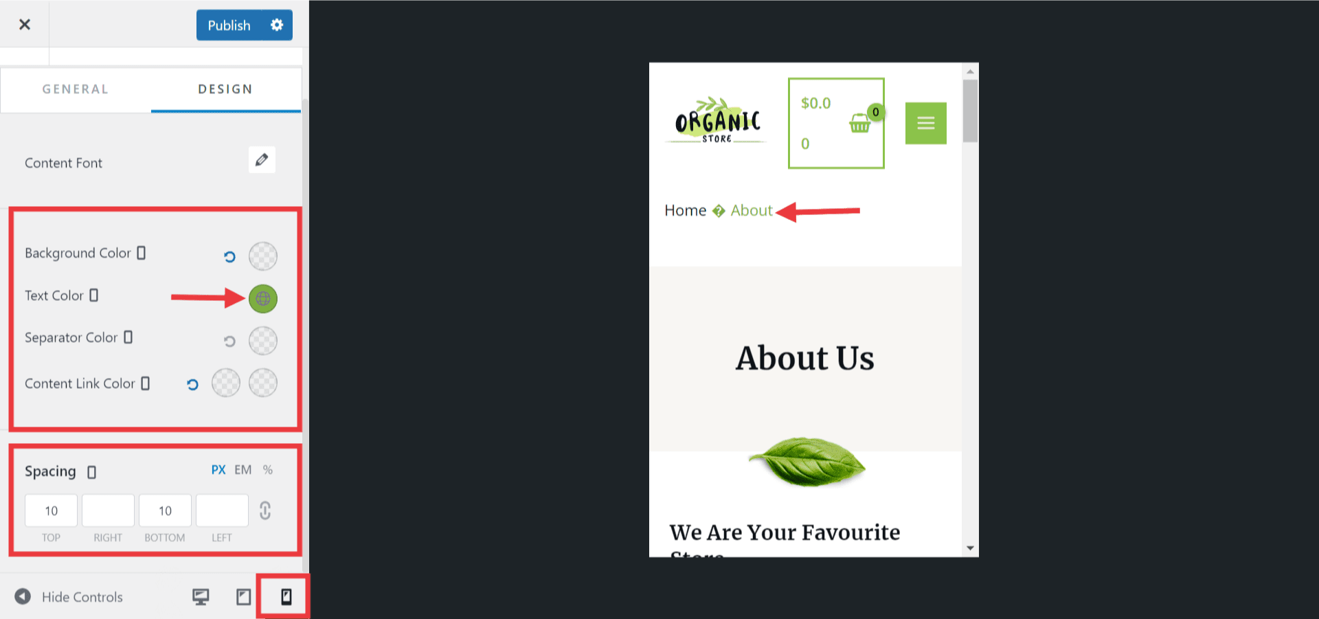
As an example, we will show you how to make your Breadcrumbs look different for each viewport size:
Step 1 – Navigate to Appearance > Customizer > Breadcrumbs and activate your Breadcrumbs in the General tab;
Step 2 – Click on the Design tab and do your settings as needed. For this example, we decided to have the Breadcrumbs background color set to black and font color to white for the desktop preview:
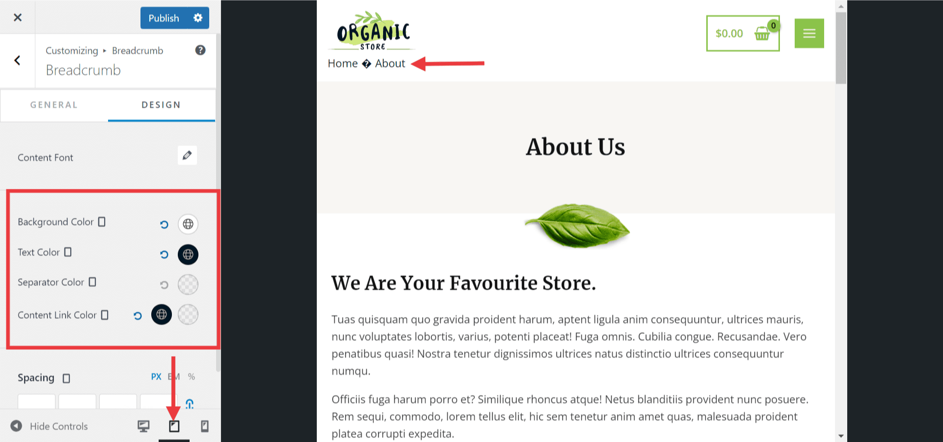
Step 3 – Switch to Tablet preview either by clicking on any responsive icons on available options or the Table Icon at the bottom of the Customizer;
Step 4 – Add settings for the tablet. In the screenshot below, you can see that in our example, we decided to have a white background with Breadcrumbs font set to black for tablet:
Step 5 – Switch to mobile preview, and apply changes for your mobile settings. In the example, we decided to change only the color of the last item in the breadcrumbs path (the current page; “Text Color” setting) to make it stand out on mobile. We also added top and bottom spacing for mobile.
Responsive Header and Footer
With Astras’ Header Footer Builder, you can also make your header and footer responsive and have them look differently for desktop and mobile devices:
- Set different Logo Width
- Site Title & Tagline Font and Color
- Set different Header and Footer Heights
- Add different widgets to your header or footer for each viewport size.
- Reorganize and position the elements differently
Hiding Elements
The “Hide on” option is available for all header and footer elements. It’s also available for each header and footer section (Primary, Above, and Below). You can hide the element or header/footer section on any of the previews using this option.
One of the examples where this option could be helpful would be showing different active elements for tablet and mobile preview in your header or footer:
Step 1 – Navigate to the header or footer builder (Customize > Header Builder or Customize > Footer Builder). Since your header and footer are linked for tablet and mobile viewports, these viewports will have the same elements active;
Step 2 – Switch to the viewport where you need to hide an active element;
Step 3 – Click on the element, end enable the “Hide on” option to hide it.

