
Do you want to optimize your checkout page design?
Is your store plagued by abandoned carts?
- Essential Ingredients of High Conversion Checkout Pages
- 10 Tips for Designing Optimized Checkout Pages with Examples
- 1. Allow Guest Checkout
- 2. Allow Multiple Payment Methods
- 3. Minimize Required Form Fields
- 4. Provide Total Order Cost Early
- 5. Create a Logical Flow Down the Checkout Page
- 6. Add Trust Signals Wherever Possible
- 7. Add Social Proof if Appropriate
- 8. Make Sure Everything Works on Mobile
- 9. Minimize Distractions
- 10. Include a Full Order Summary
- Wrapping Up
- Checkout Design FAQs
Want to reclaim lost sales by optimizing checkout?
If so, you’re not alone in wanting to improve conversion rates in your eCommerce store.
- 70.9% of all online shopping carts are abandoned.
- 18% of those abandonments are down to a checkout process that’s too long or too complicated.
That means 1 in 5 shoppers in your store who abandon their cart do so because the checkout appears too complex or too long.
That’s a lot of lost sales!
Every eCommerce store owner should optimize their checkout, which is why we created this post.
Read on to learn:
- The essential ingredients of checkout page design
- How successful stores design their checkout for maximum sales
- Checkout page design best practices
- 10 Actionable tips to optimize your checkout for higher conversion
By the end, you’ll have all the information you need to tackle abandoned carts and make more sales!
Essential Ingredients of High Conversion Checkout Pages
First let’s quickly discuss what an optimized checkout page design should look like.
A checkout page should include:
- Cart contents and prices
- Address form for billing and delivery
- Shipping method, cost and estimated delivery time
- Payment methods
- A buy now button
Those are the minimum ingredients for a functional checkout page. The more you add to the page, the more distracted or frustrated a customer can become.
A high conversion checkout page should be:
- Short – It should contain the minimum form fields to complete a purchase
- Simple – A customer should be able to complete the form and check out without having to think too much
- Easy to follow – The checkout page should be intuitive and funnel the visitor towards completing checkout.
- Informative – Give customers everything they need to know including total price, shipping cost, estimated delivery date and any other essential information.
- Full of choice – Include guest checkout, account login, delivery options, payment options, currency options and whatever else is relevant to your target market.
- Reassuring – Add trust signals, guarantee information and links to your returns and privacy policies.
- Well designed – Reflect the store design, minimize navigation and opportunities to leave checkout before completion
We think these characteristics are essential for minimizing abandoned carts and maximizing conversion.
Keep them in mind when building yours and reap the rewards!
10 Tips for Designing Optimized Checkout Pages with Examples
In “5 Things to Do to Ensure the Best Checkout Experience for Customers”, we discussed ways to build an extraordinary checkout page using WooCommerce.
Let’s look at some tips to optimize checkout with some real life examples so you can see them in action.
1. Allow Guest Checkout
24% of people abandon their cart because they have to create an account.
Allowing guest checkout is a simple way to optimize checkout and minimize friction.
The average visitor will have dozens of accounts and they probably don’t want more. That’s especially true if it’s a one-off purchase or big ticket item as they would only be occasional visitors.
As payment gateways make guest checkout easy, there’s no reason to not accept them.
Examples of guest checkout in action:
Big Chill
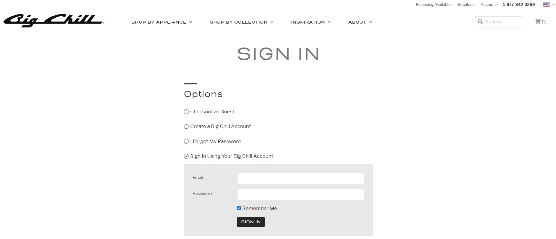
The Big Chill online appliance store is a pretty fun experience that taps into customers’ sense of nostalgia. The checkout page exudes nothing but modern convenience.
We like the Big Chill’s checkout page because there’s:
- No top navigation bar.
- Breadcrumbs to let you know what you need to do next.
- An SSL certificate seal on the page for reassurance
- The contact form fields fall in a single vertical line to simplify completion
- Everything is formatted so customers can easily complete the form
- WooCommerce checkout makes use of two pages and two steps. It also does a fantastic job setting expectations with customers from the start
What we like…
We like the guest checkout option, the progress bar at the top, the simple order summary and and the social proof box on the right.
What could be better…
The delivery charge isn’t mentioned on the product page and appears on the checkout page. ‘Surprise’ delivery charges are a big turnoff for many shoppers even though you expect it on larger items.
Lego
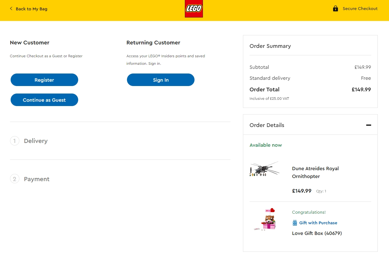
Lego has a minimalist checkout page design that’s very friendly and approachable, like the brand. It also does guest checkout well.
You have the option to checkout using PayPal on the preceding page or can select it on the checkout page. It’s simple and makes short work of purchasing, which is what we look for.
The rest of the page keeps things simple with an order summary on the right, delivery charge front and center and hidden form fields that open only when required.
We like the Lego checkout design because:
- It’s clean, friendly and approachable
- It makes it easy to check out as a guest
- There are multiple payment options
- The order summary is easy to see
What we like…
We like the entire design including guest checkout, brand colors, simple layout and the dynamic form.
What could be better…
There’s nothing we would change about this design as it’s one of the best checkout page designs we have seen..
2. Allow Multiple Payment Methods
While we’re on the subject of payment gateways, we also recommend allowing as many payment methods as possible.
This is especially important if you serve international customers. A payment method that’s popular in one region may not be available in another.
There’s no practical limit on how many methods you can offer, but we would recommend 3-4 options for the majority of stores.
The more you include, the more customers can purchase.
Amazon
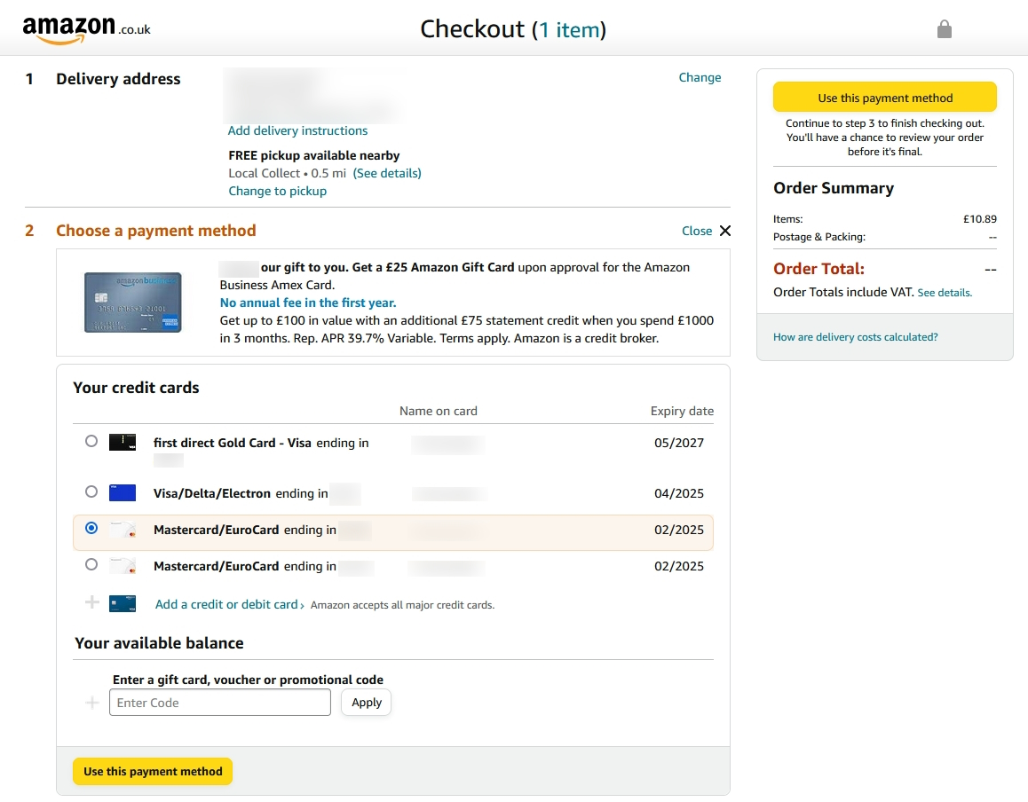
One of the many things Amazon gets right is the payment options. You can use as many as you like, add as many as you like and select one for each individual purchase.
Using gift cards or existing balances is just as easy. As is selecting a delivery method.
The order summary makes it clear what you’re spending and on what too, which adds to the experience.
We like the Amazon checkout page because:
- Logged-in users can one-click purchase
- Multiple payment options offered
- Simple payment method selection
- Expected delivery date is also included
What we like…
We like the option to select from multiple payment methods, add new ones, add coupons or gift card details in one box. We also like the summary box on the right.
What could be better…
There’s little to criticize here except that the checkout page design is a little old fashioned. That’s the same for the entire Amazon brand though.
Adidas
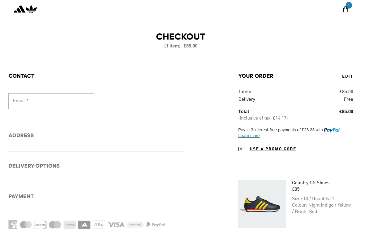
Adidas offers 10 payment options, in gray at the bottom of the screen. They include all the majors like American Express, Mastercard, Visa, PayPal and their own, AdiClub.
That enables the company to sell to a wide range of customers in different territories.
We also like the minimal checkout page design. The brand is clear throughout and the page opens up once you complete the preceding section. It’s very well designed!
The Adidas checkout page is a good example of:
- Offering multiple payment methods for the widest appeal
- Minimal checkout page design
- Dynamic form design where fields open up when required
- Showing a clear order summary with transparent pricing
What we like…
We like that all the payment methods we commonly use are covered. We also like the order summary clearly showing shipping charge or lack thereof.
What could be better…
Dynamic form design is great but you’re not quite sure whether shipping is free or not until you get to that part of the form.
3. Minimize Required Form Fields
The more work a customer has to do to get what they want, the less likely they are to try. That’s why we strongly recommend keeping checkout forms as short and as simple as possible.
Minimize forms wherever possible and use a checkbox for ‘Same as delivery address?’ to reduce them further. If you can pre-fill form fields for logged in customers, all the better.
The shorter the form, the less to get in the way while a customer is in a buying mood!
Apple
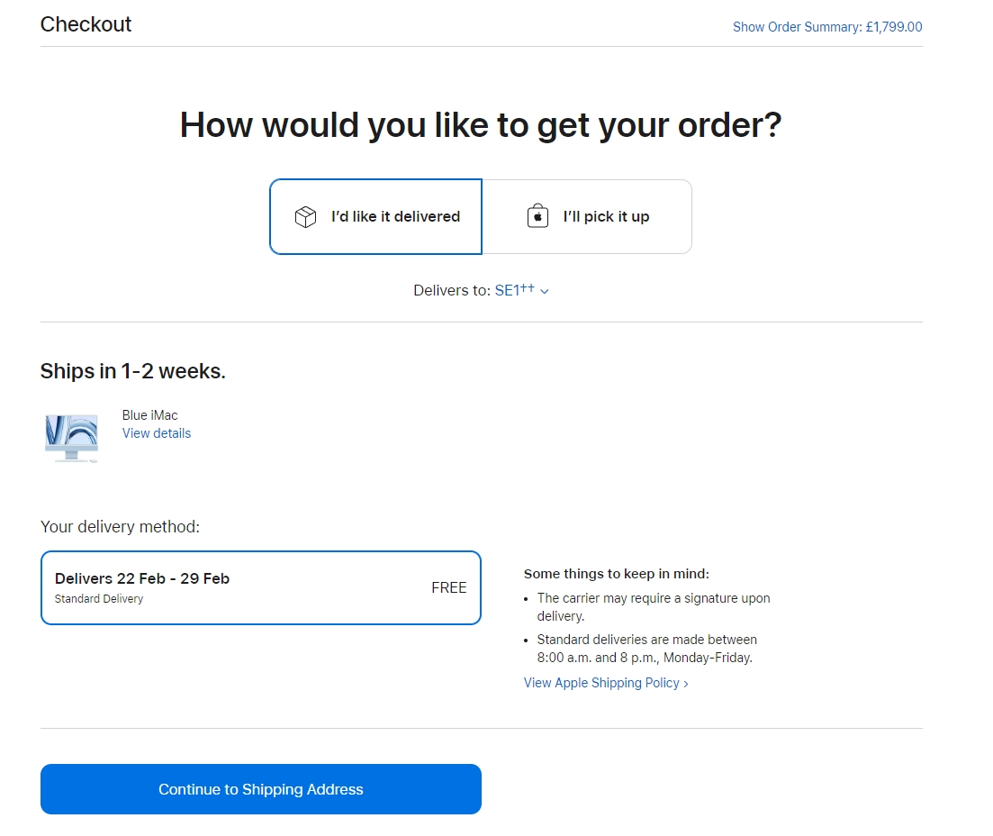
As one of the world’s largest companies, you would expect Apple to get their checkout page right. And they do.
The company uses a multi-page checkout with minimal contents on each. They offer guest checkout, use accessible language and provide options every step of the way.
We particularly like this page, where you can choose to have your iMac delivered or pick it up from your closest Apple Store. The call to action ‘Continue to Shipping Address’ makes it clear what’s coming next too.
Apple’s checkout page design is:
- Minimal and breaks things up into stages
- Written in accessible language like the rest of the brand
- Easy to understand what to do and what’s next
- Informative, tells you how much you’re paying and when to expect delivery
What we like…
We like that the checkout page reflects the core Apple brand precisely and walks you through checkout without being overbearing.
What could be better…
We’re fans of one page checkouts but there is very little to criticize here.
LatePoint
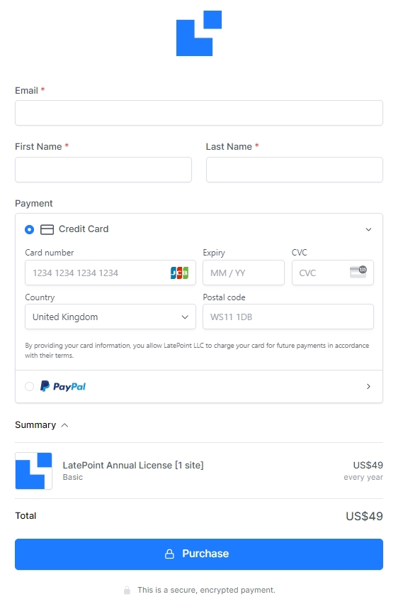
LatePoint is a WordPress booking plugin that makes it simple to add appointment booking to a WordPress website. It’s here because the checkout page is about as simple as it gets.
It’s a one page form with only the bare minimum form fields required. You can immediately see what information is needed and where and how quickly you can purchase.
Digital products do have an advantage here but LatePoint does a great job of simplifying things.
We like the LatePoint checkout page because:
- One page checkout is always welcome
- Minimal form fields to complete
- Offers two popular payment options
- Trust signal at the very bottom ‘secure, encrypted payment’
What we like…
We like that the checkout page can be seen all at once and that it’s simple and minimal. You know you’ll be done in seconds, which is a great conversion tactic.
What could be better…
A couple more trust signals might be nice, especially as the brand isn’t as well known as some. More payment options would also be welcome although the basics are covered.
4. Provide Total Order Cost Early
Not everyone likes surprises. If that surprise is added fees or hidden costs on the checkout page, it’s not going to end well.
According to the Baymard Institute, 17% of abandoned carts are because customers couldn’t see the total cost up front. That’s a lot of customers to lose on something so simple!
Make customers aware of delivery options and costs on product pages. Let them see right away how much delivery is and approximate times if possible.
Don’t leave it until the checkout page.
Bed Bath & Beyond
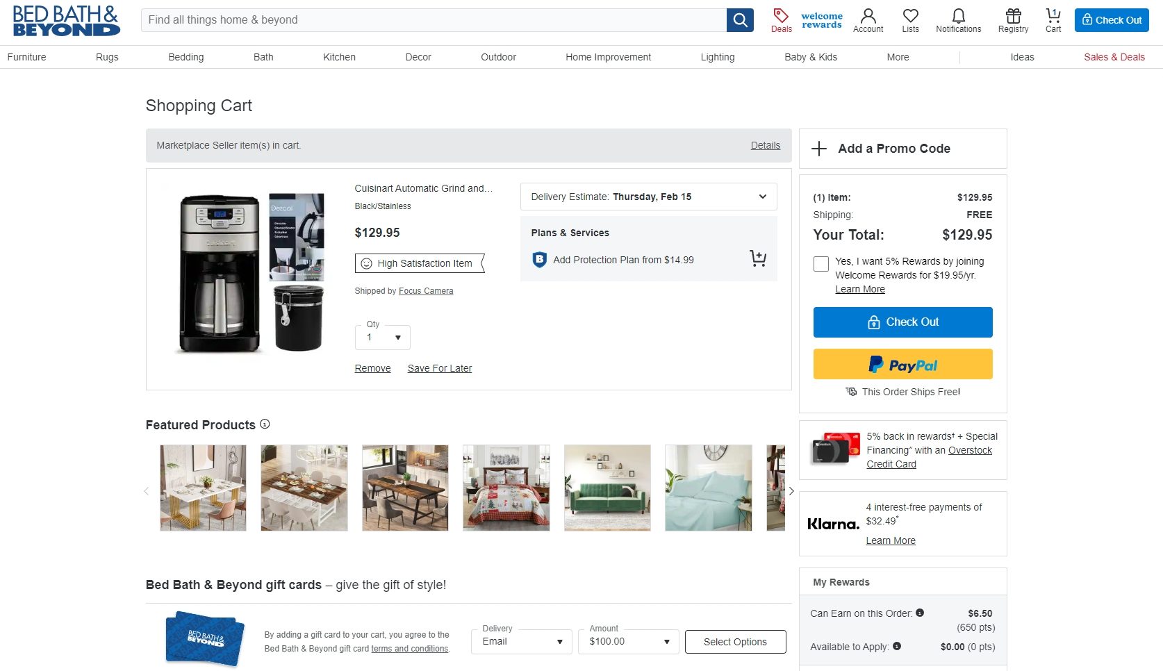
Bed Bath & Beyond knows what they are doing when it comes to retail. Their eCommerce store isn’t bad either.
There’s a lot going on here, but you can see clearly what you ordered, what it costs, how much shipping costs and the order total. You also have buy now pay later (BNPL) options should you want them.
This is the opposite of minimal checkout page design but it has been done in such a way that you can clearly see what you need to do.
Bed Bath & Beyond’s checkout page is:
- Complete and easy to follow
- Clear about the charges and total cost
- Accessible, with multiple payment options including BNPL
- Well designed and fits their brand
What we like…
We like that everything is crystal clear and you know exactly how much the product costs, how much shipping is and the total cost of your order.
What could be better…
The page is a little busy. We aren’t fans of upselling on the checkout page either. There’s a time and place for that and we don’t think that’s here.
Tredz

Tredz, an online bicycle retailer, gets checkout page design very right. The design is minimal, there are very few distractions and the total order cost is kept prominent throughout.
The page also includes mentions of a money back guarantee, links to chat and a buying guide to help overcome objections. While they provide a potential escape from checkout, their value outweighs the risk.
It’s a simple checkout page done well.
We like the Tredz page because it:
- Has a clear order summary
- Is simple and to the point
- Contains minimal distractions
- Reassures with mentions of guarantees and chat
What we like…
We like that the order summary is clear even when it’s a big ticket item. There’s also reassurance provided by the extra help and money back guarantee.
What could be better…
We’re not convinced the checkout page is the right place for a buying guide. We would ideally want to see that earlier in the sales funnel so it could help convert.
5. Create a Logical Flow Down the Checkout Page
Western audiences tend to read left to right and top to bottom. Design your checkout page to work with that.
Have your form on the left and work your way logically down the page until you reach the buy now button. It feels familiar and reassuring, which should help conversion.
If you can add an order summary, delivery options and trust badges to the right or prominently within the page, all the better!
Examples of logical flow include:
Orange Amps
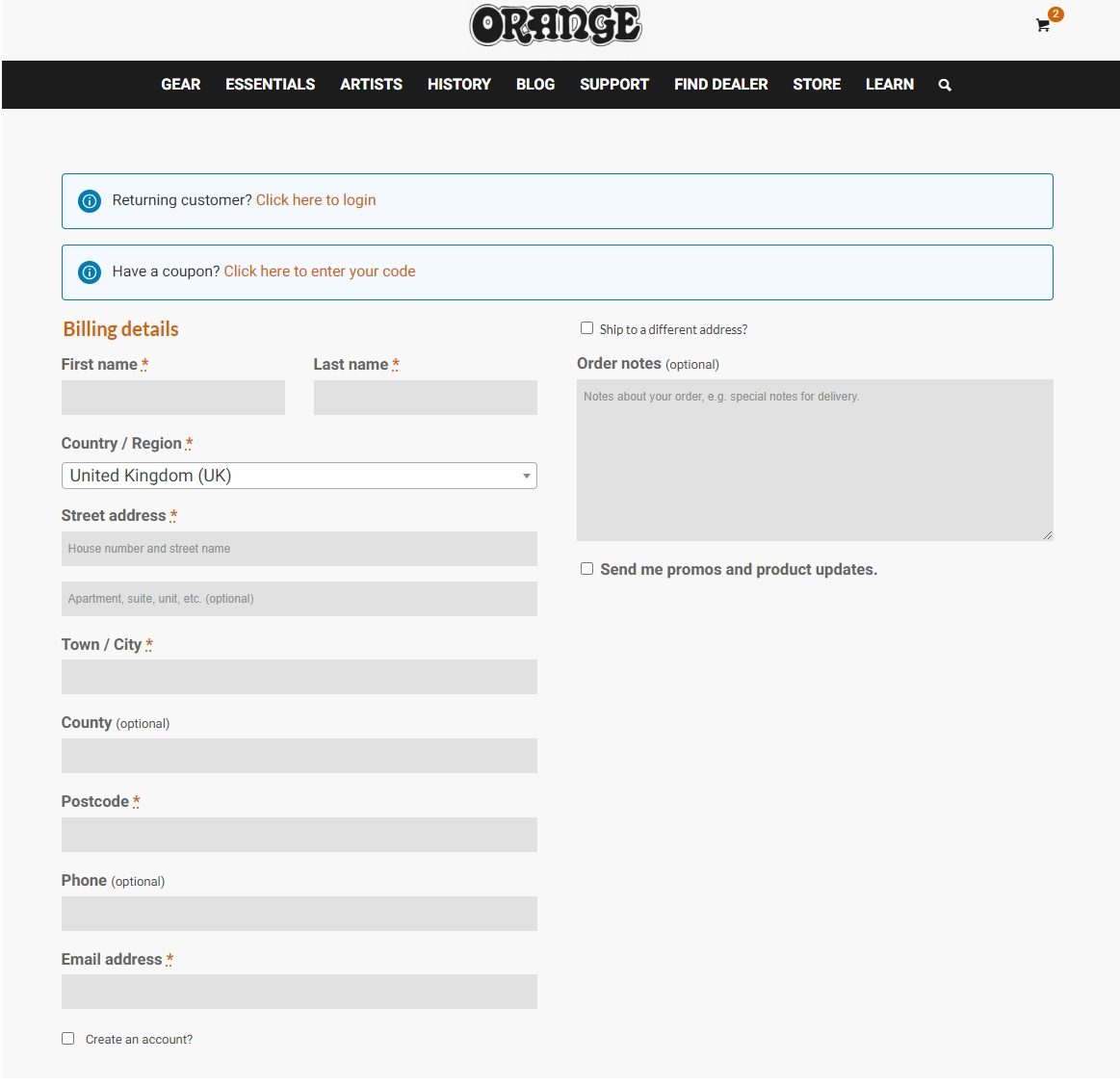
Orange Amps are a well-known manufacturer of musical equipment and sell some of them online. The store design isn’t the most intuitive but the checkout page is a great example of how to do it.
Overall, this checkout page does a nice job of streamlining the final step to conversion. It’s also a good example of a company that’s chosen to offload payment processing to a trusted third-party (either PayPal or Sage).
We believe this is a well-designed checkout page because:
- Customers have the option to log in or check out as a guest
- An account creation request occurs after the form
- Form fields are logically structured and easy to tab through
- There’s no need to retype shipping information if it’s the same as billing
- Payment methods include clearly recognizable and well-trusted logos
What we like…
We like the simplicity of the form and how it flows. Prompting to create an account after allowing guest checkout is a nice touch too.
What could be better…
There’s no mention of shipping costs, courier or estimated delivery times. We recommend every checkout page includes that information.
G-Shock
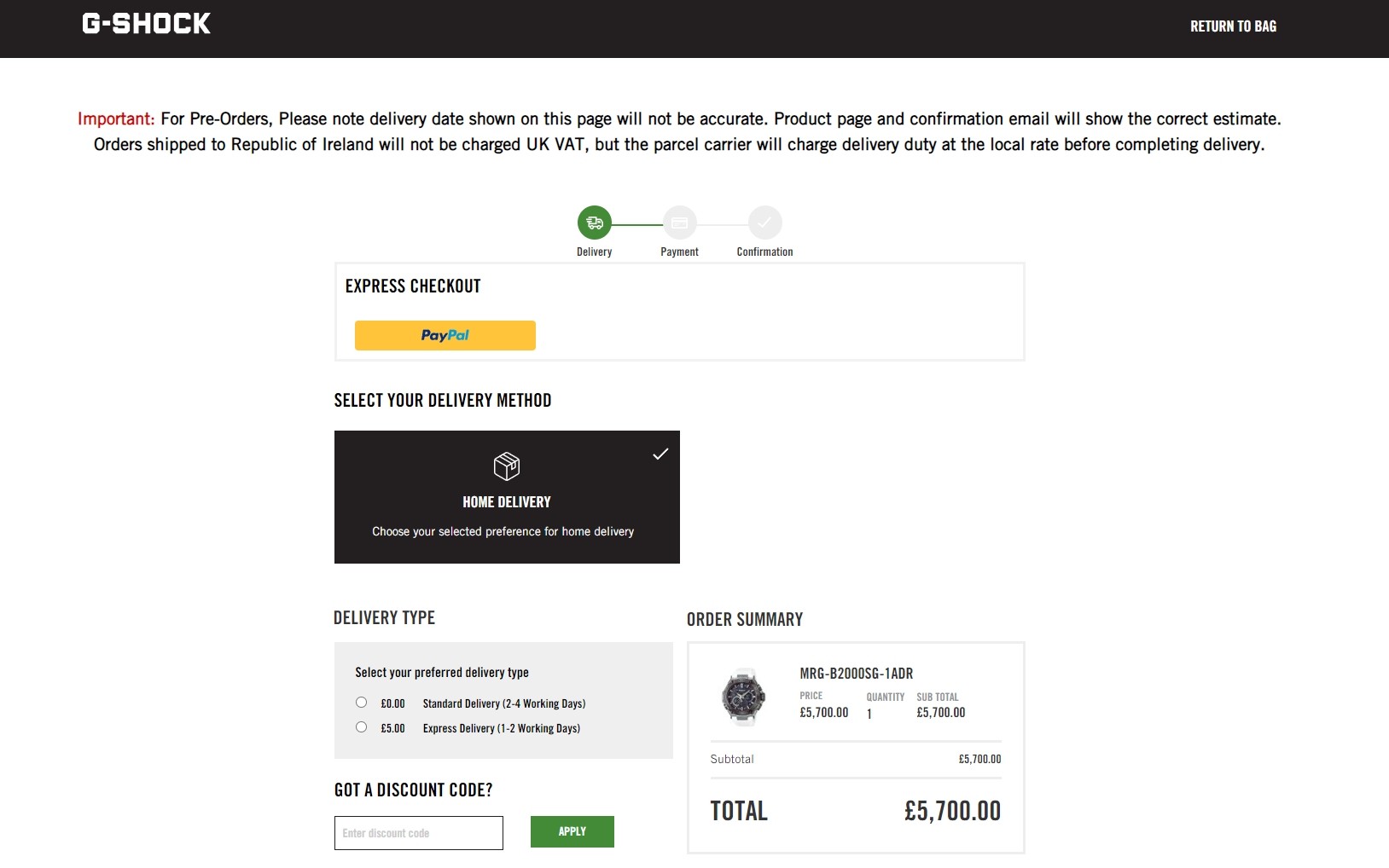
G-Shock uses a dynamic checkout page where the next part of the form is revealed only when you complete the preceding one. It offers a great flow down the page.
There’s an outline so you can see how many fields are involved and logical steps.
Choose delivery, check out as a guest or not, add the address and payment methods or choose express checkout. It’s all very easy.
G-Shock gets a lot right with their checkout page design:
- A dynamic page that unfolds as you progress
- Logical flow throughout the form
- Costs are kept clear throughout with the order summary
- Express checkout option for even faster checkout
What we like…
We like how the form unfolds like a story as you progress. We also like how the order summary stays visible throughout.
What could be better…
The trust badges are tiny and in the lower right corner. While the brand has a lot of trust, we would make those more visible.
6. Add Trust Signals Wherever Possible
Staying on the subject of trust signals for a moment. The Baymard Institute study we quoted earlier said 19% of abandoned shopping carts were because the customer didn’t trust the store with their credit card information.
Trust signals play a pivotal role in conversion. Customers are much more likely to purchase if they see ‘Verified by Visa’, ‘McAfee Secure’, ‘Secured by SSL’ and others.
Add mentions of your money back guarantee and links to your returns and privacy policies and you give customers everything they need.
See trust badges in action here:
Astra

We think our own Astra checkout page is a great design. It’s short, simple and adds clear trust signals to overcome objections.
The page also includes multiple payment options, mentions the money back guarantee and secure checkout. All designed to reassure buyers they are in good hands.
The progress bar at the top is also a nice touch so customers know exactly what’s happening.
The Astra checkout page design is:
- Reassuring with multiple trust badges
- Short and concise
- Easy to use with multiple payment options
- Transparent with links to policy pages
What we like…
We like how short the form is, made shorter by not having to ship. We also like the reassurance provided by trust badges and guarantees.
What could be better…
There isn’t actually much we would want to change here otherwise we would do it!
GhostBed
GhostBed is smart to do everything it can to get a leg up over the competition. In addition to having a beautifully designed WordPress website, the WooCommerce checkout page is very well optimized.
But that’s not actually where we want to focus your attention. GhostBed does a nice job streamlining checkout and it was a good move with the trustmarks.
You can see ‘Secure Checkout’ at the top, ‘Sleep Support’ on the right and awards at the bottom right. All make you feel better about purchasing.
Highlights of the GhostBed checkout page include:
- Secure checkout trust badge
- Simple checkout form
- All pricing, taxes, and shipping fees clearly displayed
- Multiple payment options from a range of providers
- BNPL option
- Live chat option
What we like…
We like how clean and simple the form is while offering lots of options. Good use of trust badges and a live chat widget adds to the appeal.
What could be better…
There isn’t actually much we would change here as this is one of the best checkout page designs we know of.
7. Add Social Proof if Appropriate
If you can add social proof as well as trust signals, you’re adding more reasons to trust you.
Social proof can include star ratings, number of people using your product, reviews and testimonials, either left directly with you or a third party such as Trustpilot.
Wherever your reviews are, include some of them on your checkout page.
They can help build trust and work alongside trust badges to give customers the confidence to complete checkout.
Xero Shoes
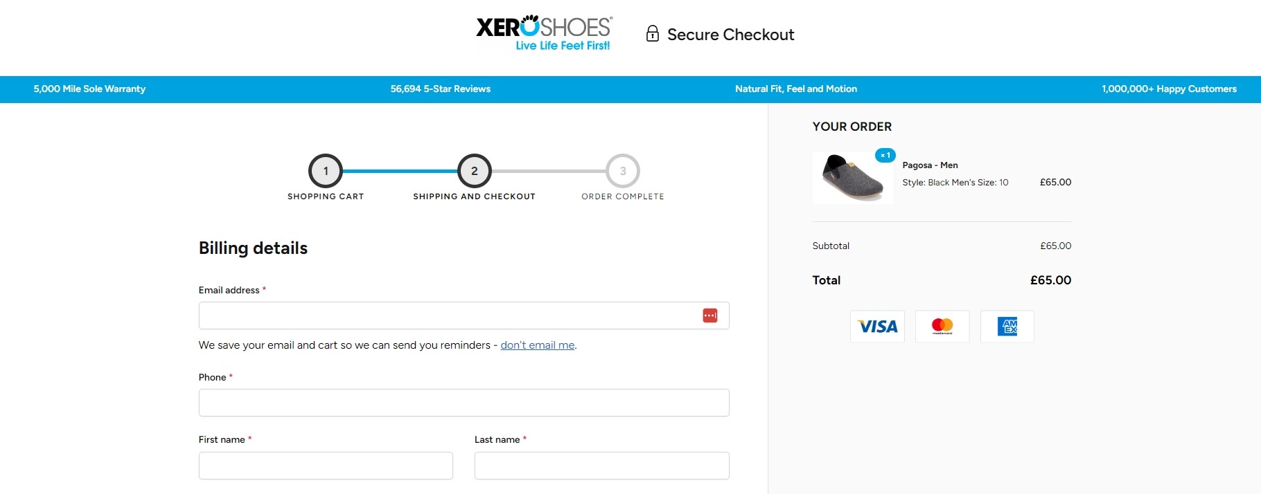
Xero Shoes adds social proof on the blue banner at the top of the page. It reads 5,000 Mile Sole Warranty, 56,694 5-Star Reviews, Natural Fit, Feel and Motion and 1,000,000+ Happy Customers.
We’re naturally interested in the number of reviews and happy customers. It’s good use of social proof on a page without it getting in the way of the purchase.
Along with a progress bar, clear order summary and logical flow, this is a great example of checkout page design done right.
We rate Xero Shoes because:
- The design is clean and simple
- The blue banner reflects the brand and includes proof
- There’s a progress bar
- Logical flow down the page towards checkout
What we like…
We like the simple design that reflects the brand while staying out of the way. The blue bar reassures new customers and should help convert.
What could be better…
The blue bar is good, but you have to look carefully to read it. We would make those points much larger and part of the order summary box.
Shoptimizer
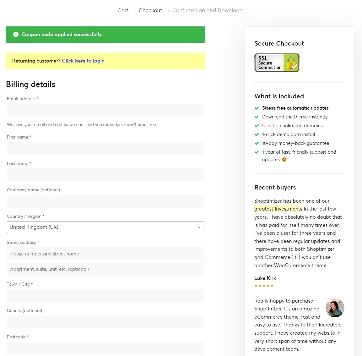
Shoptimizer is a WooCommerce template for WordPress. The checkout page is minimal but uses trust badges and social proof to help convert.
While we all know the most positive reviews will be picked for this page, it’s still reassuring to know real people like the theme. SSL secure connection is just a bonus.
The rest of the design is simple and no-nonsense, making the form and checkout itself the only thing to see.
We think Shoptimzer’s checkout stands out because:
- Social proof is front and center
- The SSL trust badge is an added bonus
- The form is simple with a logical flow
- There’s nothing else to distract you from checkout
What we like…
We like the simplicity of the page with social proof made very obvious. Including an SSL badge and not much else is also a good move.
What could be better…
The Pay with PayPal option is at the bottom of the form, which would negate you having to fill in the form at all. We would definitely change that!
8. Make Sure Everything Works on Mobile
We all know mobile web use has overtaken desktop so it’s essential your store supports mobile.
Fully responsive web design goes a long way towards that, but pay particular attention to forms. Use the right WordPress theme and your form should work perfectly, but test everything before launch to make sure.
The mobile user journey should be just as straightforward as the desktop version so do everything you can to make it happen.
eBay
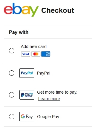
eBay offers an excellent experience on mobile whether you use the app or browser. The checkout page design is minimal and also has a logical flow, which we appreciate.
Depending on the product you buy, you’ll see payment options, delivery options, an order total and a clear buy now button.
That’s all we need to see to purchase, which is why it works so well.
We like the eBay checkout design because:
- It reflects the brand with the colored name at the top
- It’s minimal with very little design
- There are multiple payment options at the top
- There’s a logical flow with minimal scrolling
What we like…
We like that you get the same checkout experience whatever device you use. The app and browser experiences are also very similar.
What could be better…
This is another checkout page that works well. We wouldn’t change anything as it’s one of the best checkout page designs on this page.
9. Minimize Distractions
When a customer lands on your checkout page, we want nothing to stand in the way of completing the purchase. That’s the sole goal of the page so we want to minimize distractions wherever possible.
We recommend removing header and footer navigation and not including anything that doesn’t absolutely need to be there.
Leave the account login, upsells, cross-sells, promotional videos and other conversion tactics for preceding pages. Checkout should be the path to purchase and nothing else.
Two examples of minimal checkout pages include:
All Blacks Shop
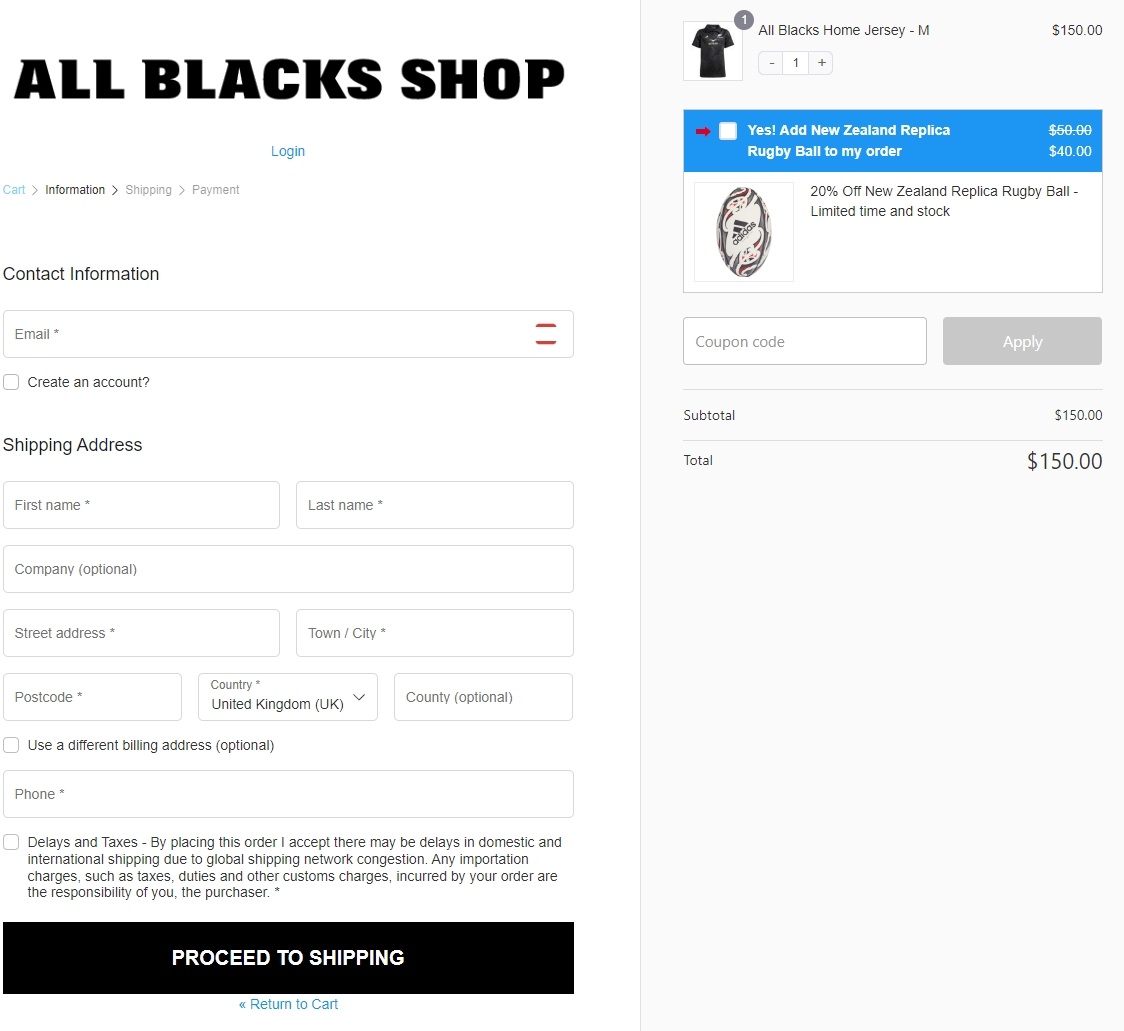
Fans of New Zealand rugby will already be familiar with the All Blacks store. What fans might not have paid attention to is how awesome this checkout page is.
You have the option to log in at the top and the form is divided into multiple pages so each is simple. The call to action is clear and there’s a cheeky upsell on the right.
The checkout page hits all the high points in delivering a truly premium experience:
- Checkout is very easy to follow
- Contact form asks only for what’s needed
- Option to use an account (but not required)
- Automatic duplication of billing information to shipping fields
- Simple order review widget
- Well-recognized payment options
What we like…
The focus is on simplicity. The checkout page requires minimal information from customers and removes as much friction as possible from the purchase.
What could be better…
It’s hard to critique something that’s very good but we would personally avoid upsells on the checkout page. We would add them earlier, but that’s just us.
10. Include a Full Order Summary
A full order summary should include what’s in the cart, how much shipping will be, how long delivery will take, payment method, order number or reference, where it’s being delivered and any other pertinent information.
If you can also give customers the opportunity to add or remove items, all the better. While you may lose a sale or two because of this, we bet you’ll see an increase overall.
Give the customer all the information they need on the page and in the confirmation email.
Under Armor
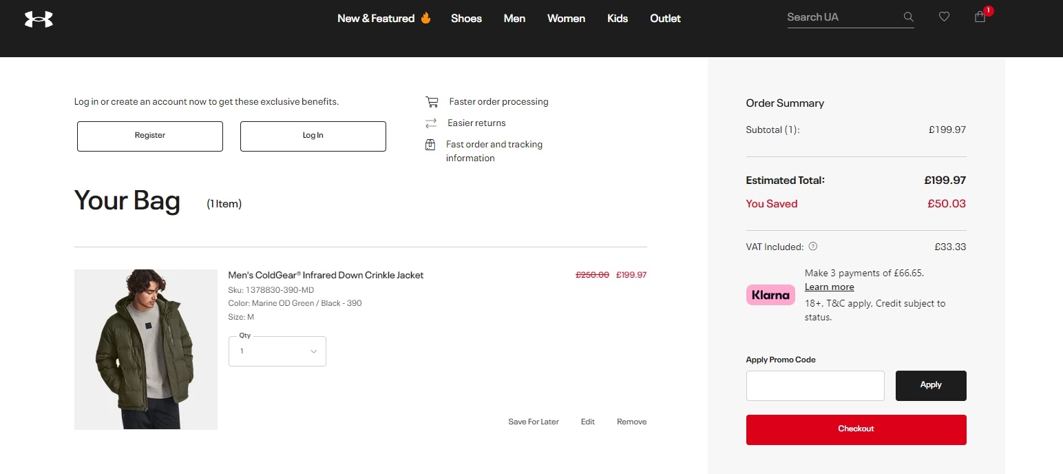
Under Armor has a clear, easily understandable order summary that we particularly like. The red checkout button is also effective, leaving you under no illusions about what to do.
Most of the examples in this post have good order summaries, with clear pricing, discount codes where applicable and delivery costs, but we like this one.
That red call to action button and shaded background make it stand out for all the right reasons.
We rate the Under Armor checkout page design because:
- The order summary is clear and well designed
- The red call to action button draws attention
- The ‘You Saved’ section is particularly good for conversion
- The product image is also good
What we like…
We like the checkout page as a whole as it’s young, energetic and reflects the brand. The order summary is especially good.
What could be better…
There’s a cross-sell box underneath the main order summary. That’s an opportunity to leave and we wouldn’t suggest doing that.
Doctor Martens
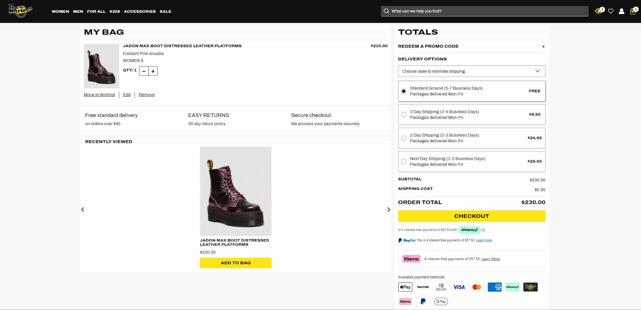
Doctor Martens goes in a different direction than Under Armor with their order summary, as literally everything is in the same box.
You can see delivery options, payment options, order total and add a promo code if you have one. There’s a lot there but it’s all easy to understand.
The shipping options element is a nice touch as it shows the cost and approximate time too.
We like this checkout because:
- Everything is on the order summary
- Including shipping costs and times is smart
- It reflects a well-known brand
- Multiple payment options are included
What we like…
We like the checkout page design, spacing and order summary. We like how it includes everything you need to know along with the total price.
What could be better…
The center section looks a little empty. Even the upsell looks oddly placed. We would refine the design a little to make it look more even.
Inspired by any of these ideas?

Wrapping Up
If you use WooCommerce or a theme like Astra to build your online store, you’re off to a great start.
But your journey doesn’t end there.
eCommerce is a marathon, not a sprint and will involve continually looking at your store and your stock to see what works and what doesn’t.
Use the tips on this page and you’re setting yourself up for success. More sales, more profit and a more successful store. Who doesn’t want that?
Do you have any checkout page design tips to share? Any stories to tell? You know what to do…
Checkout Design FAQs
Have questions on checkout pages or design? We have answers.
How do I create a checkout page?
You can create a checkout page using WordPress, WooCommerce or SureCart. eCommerce platforms come with a readymade checkout page. You can customize that to suit your needs or use blocks to create one from scratch in the same way you would create any page. This guide shows you how to create or customize a checkout page.
How do I optimize my checkout page?
You can optimize your checkout page using the tips in this post. Keep the design the same, use minimal form fields and keep the page as short as possible. You want as few barriers between the customer and the buy now button as possible. Do that and you’ll have an optimized checkout page.
What is the difference between a sales page and a checkout page?
Sales pages are much longer and need to sell the product. The checkout page seals the deal and converts desire into action. A sales page should promote the product and convince the customer to buy. The checkout page enables them to buy.
How do I make checkout easy?
You can make checkout easy by considering the customer journey. Use minimal steps, offer multiple payment types, different delivery options, tell the customer when to expect their product and how much everything will cost. Finally, add a clear buy now button so the customer knows exactly what to do. Do all those things and checkout is as easy as it gets.
What is checkout abandonment rate?
Checkout abandonment rate, also called cart abandonment rate, is the percentage of sales lost when customers add items to their cart but don’t purchase. Just over 70% of all online purchases are abandoned, which is why checkout optimization and cart abandonment tools are so important.

Abhijeet Kaldate is the co-founder and CRO of Brainstorm Force. With a keen eye for detail and a knack for getting things done, Abhijeet oversees the company's operations, managing key areas such as HR, marketing, design and finance.
Disclosure: This blog may contain affiliate links. If you make a purchase through one of these links, we may receive a small commission. Read disclosure. Rest assured that we only recommend products that we have personally used and believe will add value to our readers. Thanks for your support!


How can i edit the checkout with astra and elementor?
I can’t find any tutorials…