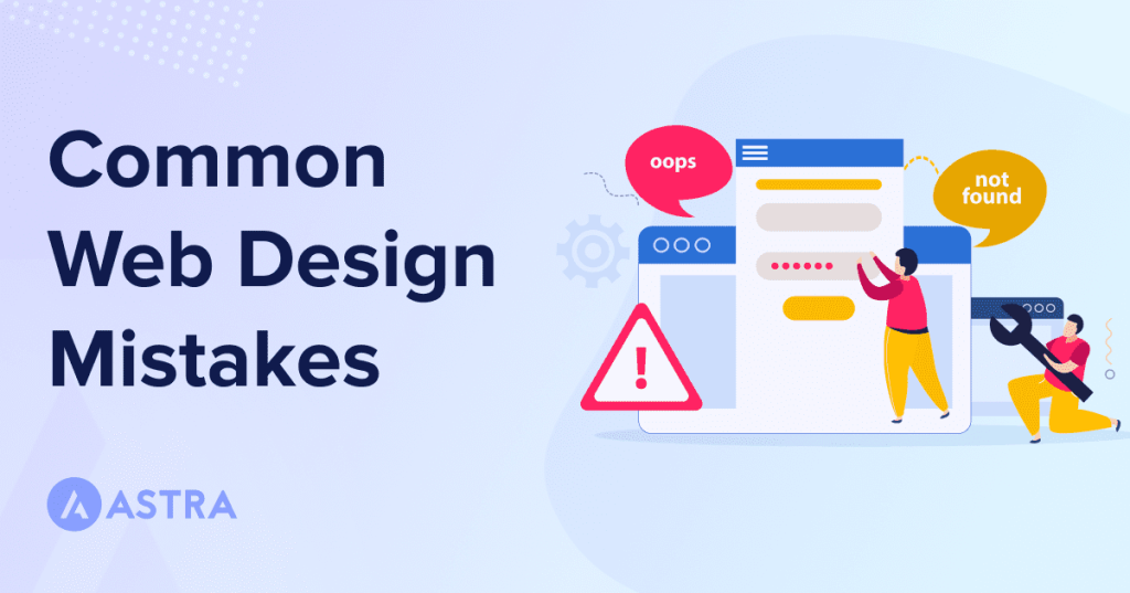
Web design mistakes can be costly for businesses, leading to lost potential customers and revenue. A poor user experience can drive away visitors, and if your website isn’t visually appealing or easy to navigate, it can even turn people off.
According to a study conducted by Stanford, 75% of people make judgments about a company as a whole based on its web design alone.
Which means it’s even more important to avoid mistakes during the web design process, don’t you think?
That’s why today we’re covering 17 common web design mistakes and how to avoid them.
By the end, you’ll know what design mistakes to avoid so your website can serve as the best representation of you and your company.
- 1. Not having a clear goal for each page
- 2. Not enough information
- 3. Not optimizing site structure
- 4. No clear CTA (Call to Action)
- 5. Too many CTAs
- 6. Not building responsive pages
- 7. Not optimizing whitespace
- 8. Too many ads
- 9. Too many popups
- 10. Too much information
- 11. Inconsistent or poorly chosen typography
- 12. Inconsistent branding across pages
- 13. Not taking advantage of 404 pages
- 14. Not optimizing for speed and performance
- 15. Not including a search option
- 16. A lack of clear contact information
- 17. Not prioritizing site security
- Avoid these common web design mistakes and improve your site's success
1. Not having a clear goal for each page
It’s important to have a specific purpose for every page on your website. Each page should have a clear goal, whether it’s to inform, persuade, or sell.
Without a clear goal, your page may lack direction and fail to effectively communicate its message.
For instance, let’s imagine a homepage for a fashion retailer that includes a jumbled mix of information about the company’s history, latest collections, and sale items.
This can be confusing for users, who may not know what the main purpose of the page is or what action they should take.
To fix this, the retailer would need to determine the main goal of each page and make it clear to users through the use of headings, subheadings, and a clear layout.
There should be separate pages for company history, current collections, and sale items. All with clear headings and calls to action for each rather than all of this info tossed onto a single page.
In the real-world, you simply need to navigate to eBay to see a good example of this issue.
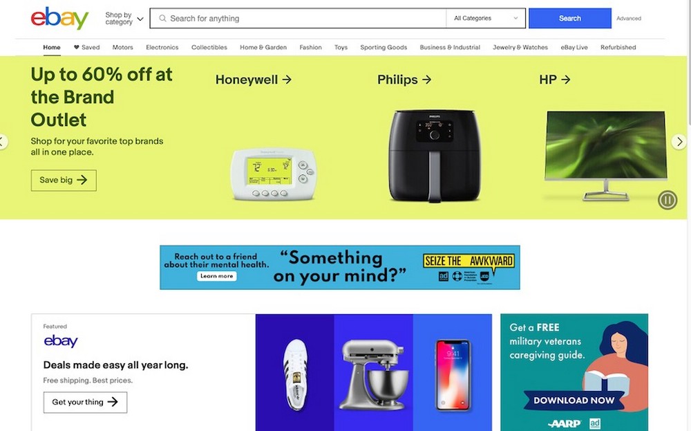
Not only is the website’s design cluttered, it’s also difficult to parse out what you’re supposed to do.
The homepage currently shows a slider with items on sale, but it also has a lot of ads. It’s hard to tell what you’re supposed to click on.
Should you sign up for an account? Who knows!
Since the entire point of eBay is to look for items on sale for auction, it would make much more sense to make the search bar figure more prominently on the homepage.
After all, that’s the entire point of the site — to search for something to buy!
2. Not enough information
Your website should be designed with the user in mind. This means including enough information for them to make an informed decision.
But not so much that it becomes overwhelming.
Take for instance a product page for an electronics retailer that only includes one small image and no detailed information about the product.
Without specifications, pricing, and customer reviews, you may not have enough information to determine if the product is right for you or not.
Instead, you could Include multiple high-quality images, as well as detailed descriptions and specifications.
You could also consider including pricing, customer reviews, and any other relevant information that can help you make an informed decision before making a purchase.
For instance, the Dom Perignon website is nice to look at but it’s super sparse on information. It serves as a good example of minimalism to detrimental effect.

Yes, a streamlined design is lovely and if you’re looking at Dom Perignon, you probably know what you’re looking for.
But if it’s at the expense of providing new visitors with helpful info, you’ve likely gone too far.
3. Not optimizing site structure
According to Top Design Firms, 38% of those visiting a website immediately evaluate its navigational links, menus, and overall structure.
This makes sense. A well-organized website is easy for users to navigate and find what they’re looking for.
On the other hand, a poorly structured website can be frustrating and cause users to leave.
Using a hypothetical example, let’s say there’s a healthcare website with a confusing menu structure and no clear hierarchy.
The menu includes a mix of information about the healthcare provider, their services, and patient resources, but it’s not clear to users where to find specific information. This can make it difficult for a new patient to navigate to find the right forms to bring to their first appointment.
Or, it can make it a challenge for other interested parties to find out what services the healthcare provider offers.
You can see this sort of issue on full display on the Toronto Cupcake website.
At first glance, it looks like the entire site is just an image of cupcake boxes and some text. But upon closer examination, there are text links along the site’s footer.
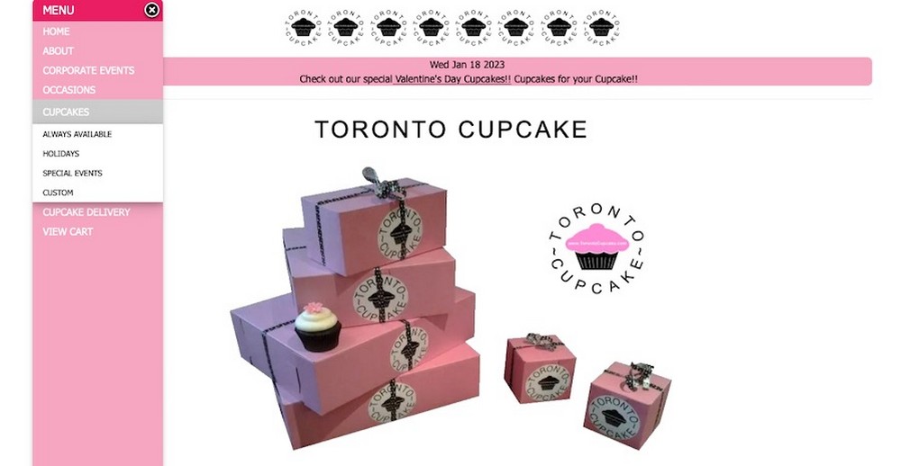
There’s also a hamburger menu on the left hand side of the screen, but even revealing that doesn’t help much: dropdown menus drop straight down and cover other menu items.
To fix this, the website should have clearly defined categories with logical menu structures and hierarchy.
Consider using drop-down menus for subcategories that stack outward so as to not obscure other options.
It’s also best to stick to familiar menu structures and positioning with text links across the top of the website and any hamburger menu links being positioned on the upper right hand side.
For our example healthcare website, they could have separate top-level menu items for “About Us,” “Services,” and “Patient Resources,” with submenu items for each.
4. No clear CTA (Call to Action)
A call to action is a button or link that tells users what you want them to do next. It could be to make a purchase, sign up for a newsletter, or download a resource.
Without a clear CTA, users may not know what action to take.
To illustrate, let’s say there’s a landing page for a software company that includes a lot of information about the product but no clear CTA button.
Users may be interested in the product, but without a prominent CTA, they may not know how to take the next step, whether that be signing up for a newsletter or making a purchase.
To remedy this issue, you should include a prominent CTA button on each page and make it clear what action you want users to take.
For the fake software company we discussed above, they could include a CTA button that says “Sign Up for a Free Trial” or “Buy Now.”
You can see this on the Vortex Technology website.
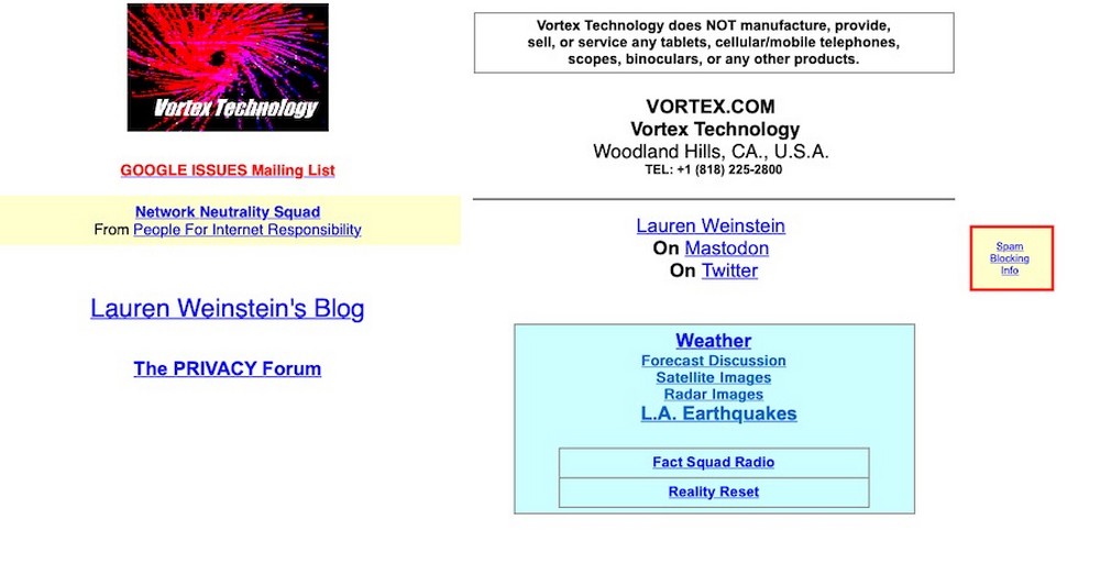
The design is super outdated, of course, but it’s also unclear what exactly you’re supposed to be clicking on here.
Who is this site for? What are they providing?
5. Too many CTAs
While it’s important to have a clear CTA, having too many can be overwhelming and distract users from the main goal of the page.
For instance, imagine you have a homepage for a travel website with multiple CTA buttons scattered throughout the page.
The page includes buttons for booking a flight, rental car, and hotel, as well as a newsletter sign-up form and links to social media.
This can be confusing for users, who may not know which action to take first or may feel overwhelmed by the number of options.
To fix this, you can limit the number of CTAs to one or two per page, especially above-the-fold.
For this travel website example, they could choose the most important action, such as booking a flight, and make that the primary CTA.
They could also include a secondary CTA, such as a newsletter sign-up form, but make it less prominent than the primary one to minimize confusion.
Though obviously a successful eCommerce site, Walmart offers a good example of what not to do.
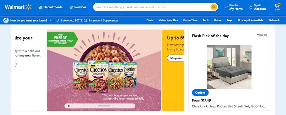
Their homepage is riddled with CTAs that prompt visitors to start shopping, pick a delivery time, select a local store, and to sign up to become a member of Walmart+.
It’s a lot!
6. Not building responsive pages
With the increasing use of mobile devices, it’s essential for websites to be mobile-friendly. This means that the website should adjust to fit the screen size of the device it’s being viewed on automatically.
A good example of what not to do would be a blog that’s not mobile-friendly and is difficult to navigate on a phone.
The website uses a fixed-width layout that doesn’t adjust to the size of the screen, making it hard to read the text and click on links.
This is an issue that cannot be ignored. According to GoodFirms research conducted in 2021, more than half of all internet traffic originates from mobile devices.
Moreover, over 53% of web designers have cited a lack of responsiveness across all platforms as the prime reason why a website needs to get redesigned.
There’s really no excuse for it in this day and age. Despite that, the Craigslist website isn’t responsive, making the site complicated to navigate on mobile devices.
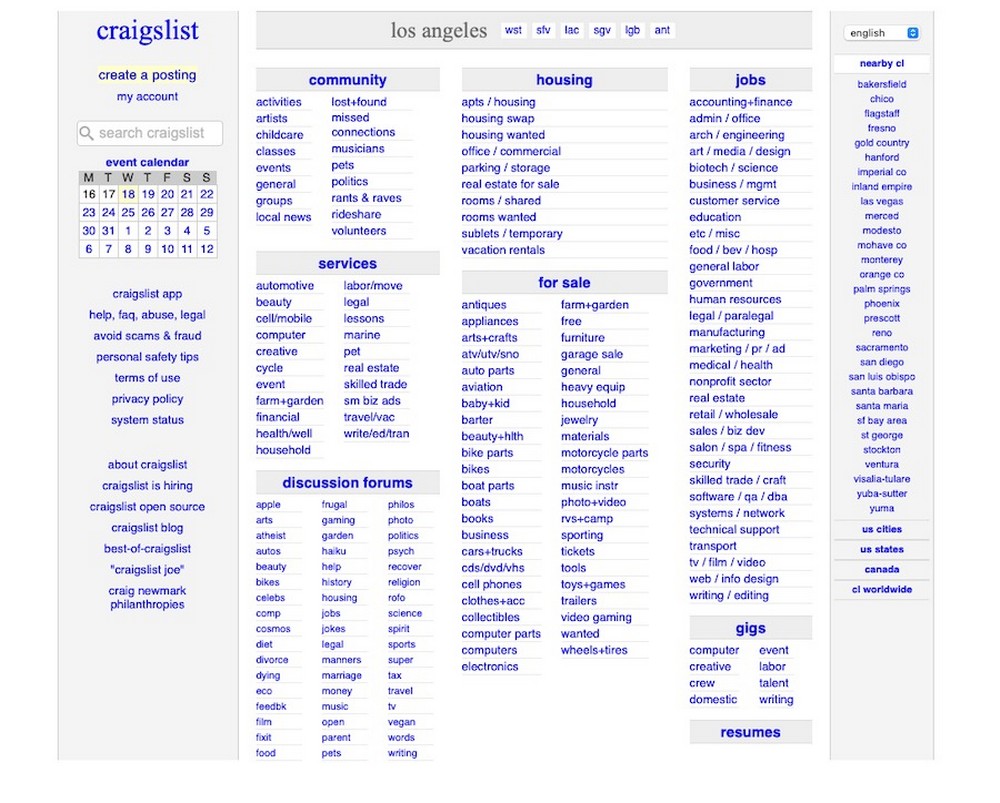
If you want to meet your visitors where they are (which is on a smartphone or tablet), you need to ensure that your website is mobile-friendly.
Obviously, the best fix here is to use responsive design techniques to ensure that your website looks and functions well on all devices.
This includes using fluid grids and responsive images, and testing the website on different devices to make sure it looks and works well.
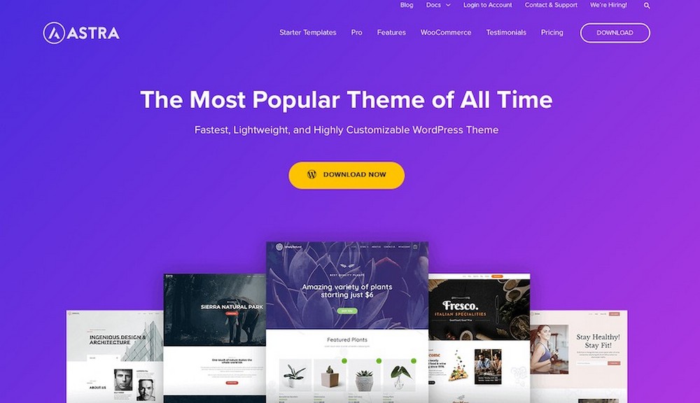
You can also select a responsive WordPress theme that can remedy this problem by default.
Our Astra WordPress theme is a great choice here as it comes with built-in mobile responsiveness and lots of customization options.
7. Not optimizing whitespace
Whitespace, also known as negative space, is the empty space around elements on a webpage.
Proper use of whitespace can help to focus the user’s attention and make the page more visually appealing.
Let’s say you’ve happened across a cooking website. It has a cluttered layout and little whitespace.
The page includes multiple images, ads, and links, making it hard for users to focus on any one element. Unless a super well-established brand, the bounce rate here would likely be high.
You can see whitespace used improperly on the actor Ed Begley Jr’s sustainable lifestyle website.
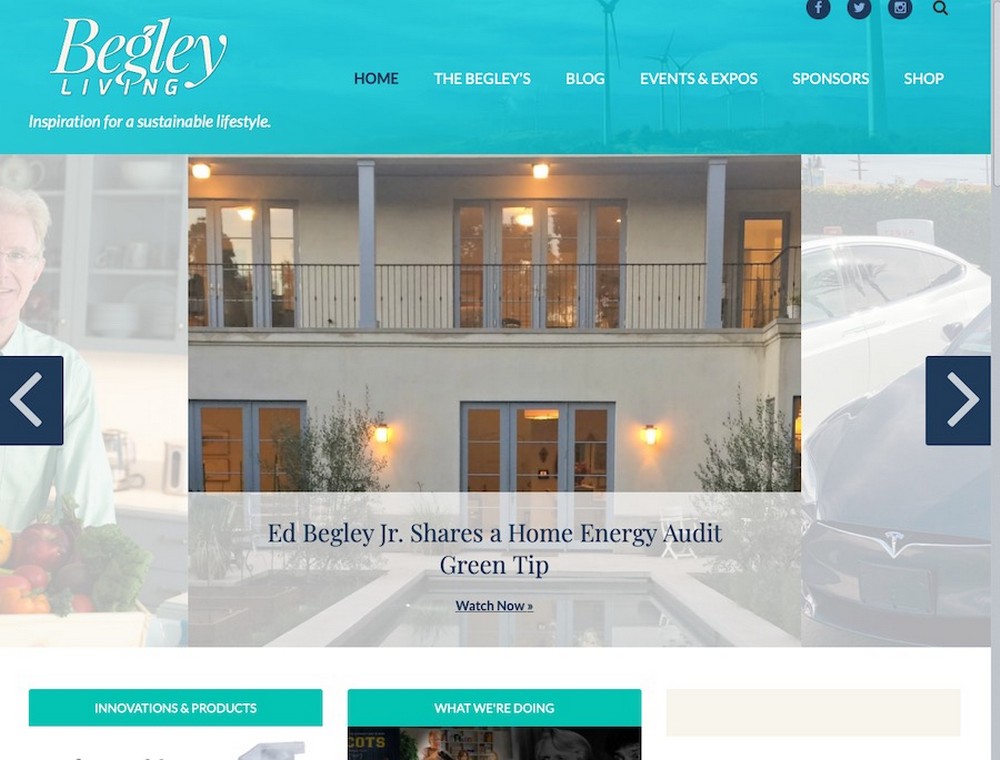
While the overall design isn’t bad, there are some strange things happening with the site’s whitespace, specifically around the featured slider. It fades out part of the image, making the alignment look off.
There’s also an issue with where blog posts are displayed, leaving a large area to the right of the screen empty.
To fix this, you can use whitespace effectively to separate different sections and draw the user’s attention to specific elements.
This can be achieved through the use of margins, padding, and line spacing.
8. Too many ads
While ads can be a good source of revenue, having too many can be overwhelming and distracting.
It can negatively impact the user experience and drive away potential customers.
A news website with banner ads on every page and popup ads that constantly interrupt the user isn’t a great look.
This can be annoying for users, who may feel like they are constantly being bombarded with ads and can make them less likely to return.
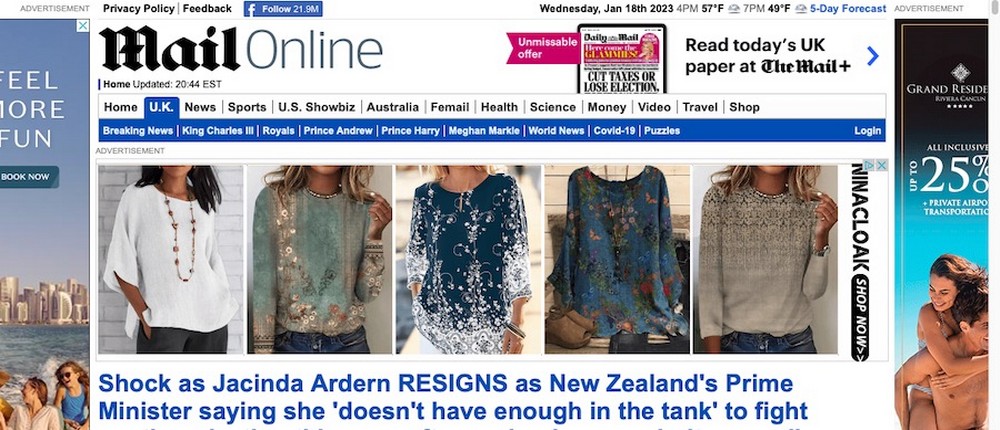
You can see this issue in action on The Daily Mail website. It has ads dotted all over its homepage that actively distract from its content.
Limit the number of ads and make sure they are relevant and not too intrusive.
Consider the user experience and make sure the ads are not taking away from the content of the website.
9. Too many popups
Popups can be a useful way to get users to take a specific action, but having too many can be annoying and drive users away.
A good example of this would be a website for a charity organization with multiple popups that appear as soon as the page loads.
This can be frustrating for users, who may feel like they are being constantly bombarded with requests for donations and may be less likely to take action.
Sometimes it’s not even a matter of the number of popups, however, it’s just their general intrusiveness that’s the issue.
When you visit a page on The Guardian for the first time, you’re greeted with a large popup at the bottom of the screen requesting you donate.
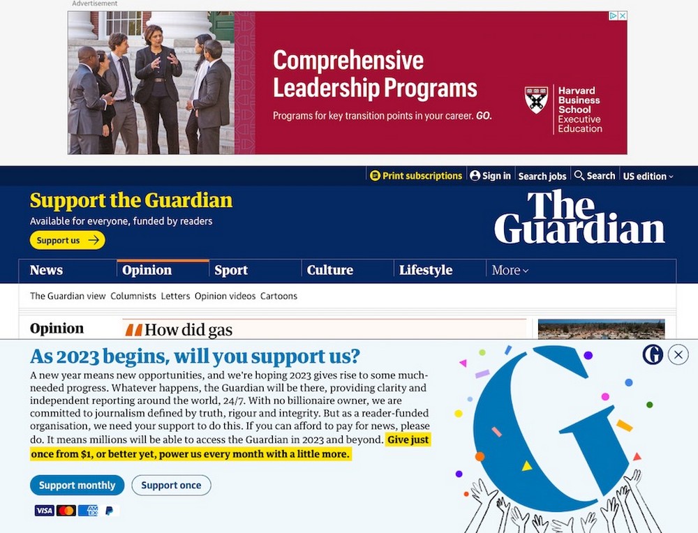
Of course, when paired with the site’s large ad space at the top of the screen, this popup obscures the entirety of the site’s content.
This is thankfully an easy fix.
Simply use popups sparingly and only when necessary.
Make sure they are not too intrusive and can easily be closed. Consider the user experience and make sure the popups are not taking away from the content.
10. Too much information
While it’s important to provide enough information, having too much can be overwhelming and cause visitors to leave.
A solid example of this occurrence would be a product page for a furniture retailer with a lengthy, unorganized description that is difficult to read.
The page would include multiple paragraphs of text, as well as a list of features and technical specifications.
A page designed in this way would be overwhelming for anyone who may not have the time or patience to read through all of the information.
Not to labor the point, but eBay again serves as a good example of this issue.
Individual product pages are user generated but their overall layout is often so cumbersome and confusing.
It’s a wonder anyone can make sense of what information is being presented, whether it’s product images, specifications, features or reviews.
Keep information concise and organized. Use headings, bullet points, and images to break up large blocks of text.
Consider what information is most important for people to know and highlight it.
Include additional details in a secondary location, such as a separate “Technical Specifications” section.
11. Inconsistent or poorly chosen typography
Typography is an important aspect of web design as it helps to create a hierarchy of information and sets the tone of the website.
Inconsistent or poorly chosen typography can be distracting and make the website difficult to read.
Let’s say you have a personal blog but now want to make it more professional.
If it has multiple font styles and sizes that do not match the overall design and the page includes headings in a sans-serif font, body text in a serif font, and captions in a handwritten font, it can be confusing.
Visitors would have a hard time distinguishing different levels of information at a glance, and that’s not good.
Now, the typography on the website for Pacific Northwest X-Ray Inc. might be the least of its concerns, but it’s still worth mentioning anyway.
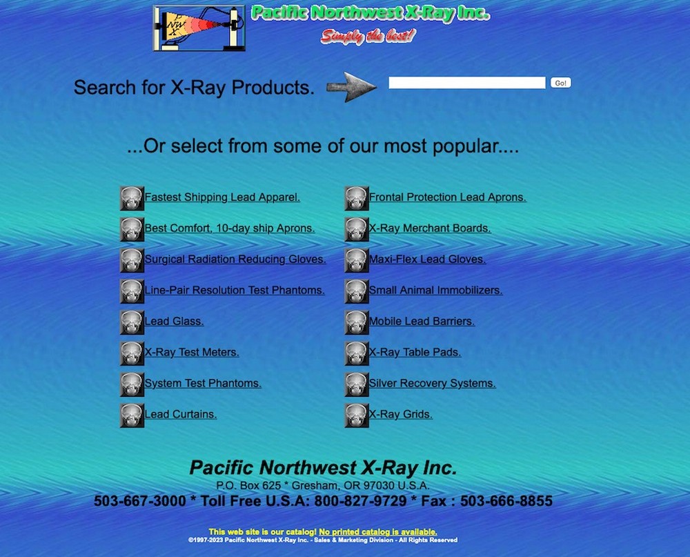
Not only does the site look like it was built in 1997, it also features multiple fonts of clashing colors and sizes.
Good website typography will be intuitive and fit the overall design.
To achieve this, choose a consistent font style and size for headings and body text, and make sure it fits the tone and branding of the website.
Consider using a single font family with different weights and sizes for different levels of headings and body text for even greater consistency.
12. Inconsistent branding across pages
Having a consistent brand is important for building trust. Inconsistent branding across pages can be confusing and make it difficult to identify with your business.
This issue in action would look like a website for a small business with different logos and color schemes on different pages.
The homepage might use a blue and green color scheme and a circular logo, while the “About Us” page uses a red and yellow color scheme and a rectangular logo.
This can be confusing for visitors and they might even think they left your website somewhere along the way.
Even though the overall design for the New Century Chamber Orchestra’s website is decent, they miss out on major branding opportunities by being so inconsistent with their color choices.

The logo is nice, so it’s a shame the colors within it aren’t used throughout the entirety of the site.
It just all looks a bit haphazard.
You can avoid this problem by using a consistent logo, color scheme, and design elements across all pages of your website.
Choose a color palette that represents your brand and use it consistently across every page. Use the same logo on all pages, too.
13. Not taking advantage of 404 pages
A 404 page is displayed when someone tries to access a page that doesn’t exist on your website.
Instead of just showing a boring error message, you can use this opportunity to guide users to other parts of your website.
An example of a missed opportunity would be if you have a basic 404 page with just an error message and no options for the user.
Sure, it might let visitors know they’ve happened across a page that doesn’t exist, but by failing to redirect them elsewhere, you stand to lose them altogether.
By not adding some sort of customization to this space, you miss out on the chance to create a more positive user experience and give visitors a lasting impression of your brand.
Translate.com does have a 404 page that redirects visitors back to its homepage, so that’s a good move.
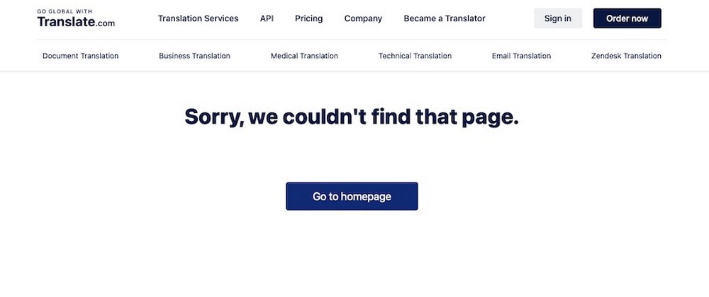
However, it misses a major opportunity here to give people a sense of their brand and mission statement. Instead, it’s just a bland, “Sorry, we couldn’t find that page,” message.
A better choice would be to build a custom 404 page with links to other pages on your website or a search bar to help users find what they’re looking for.
Consider including a humorous or creative message to lighten the mood and make the experience less frustrating.
14. Not optimizing for speed and performance
When your website lags, it can lead to a dissatisfying user experience and spur them to abandon the page.
This can also have an adverse effect on your search engine rankings as well as your overall business.
You see this happening often on websites with large image files that take a long time to load. This can be frustrating and visitors will often give up and leave the website before it finishes loading.
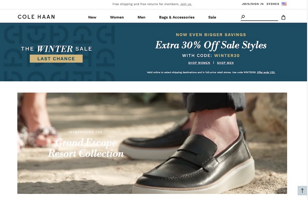
The Cole Haan website is a prime example of this. Though the site’s design is lovely and suits its brand well, the homepage video and large images slow down loading times considerably.
Thankfully, remedying this isn’t too difficult.
Simply optimize images and other media files, use caching, and minimize the use of heavy scripts to improve website speed and performance.
Using a smart video player like Presto Player can minimize video load times too.
Consider using a tool like WP Rocket to test the performance of your website and make improvements to it with just a few clicks.
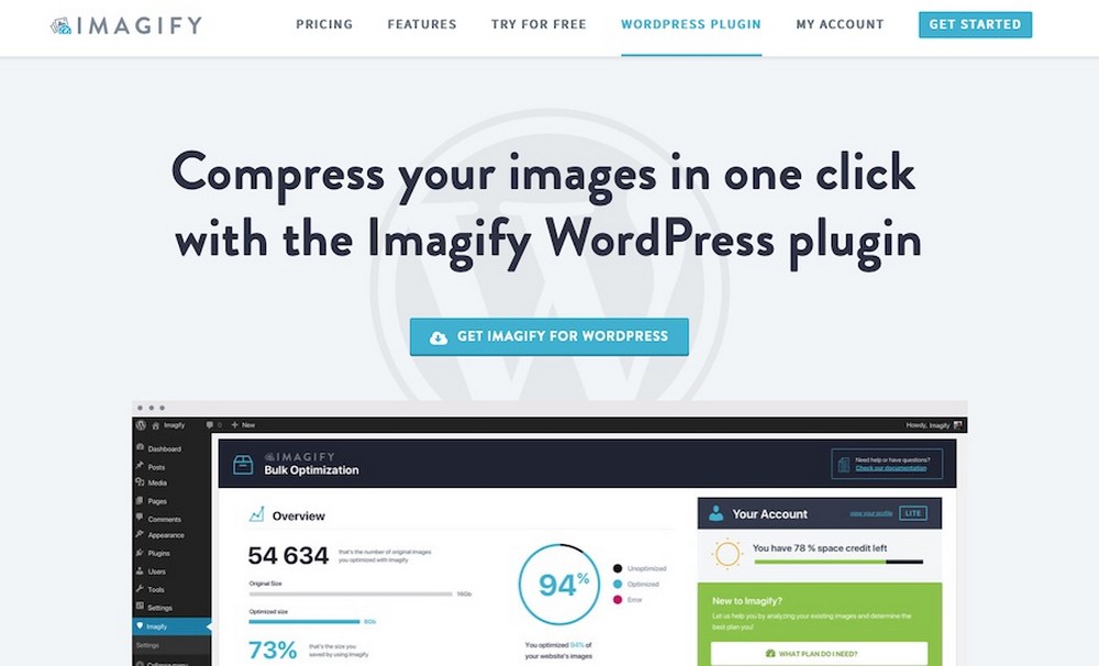
A plugin like Imagify is another great choice for optimizing images. It can reduce the file size of your images without compromising on quality.
15. Not including a search option
A search bar can be a helpful feature to quickly find specific information on your website.
Without it, visitors will have to manually navigate through your website in the hopes of finding what they’re looking for.
Imagine now a website for a large retail chain with no search bar.
This would undoubtedly make it difficult for users to find specific products or departments within the store. It’s likely that a significant portion of potential customers would get frustrated and leave the website empty-handed.
Adding this feature will not only improve the user experience, but it’s also good for SEO.
As users search and click through the website, they will generate more content that can be indexed by Google, which can help your website rank higher.
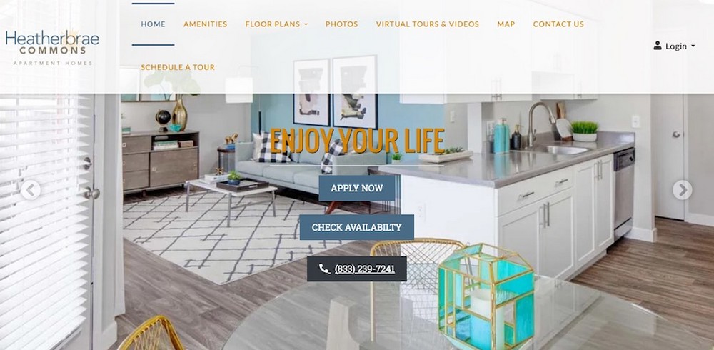
The Heatherbrae Commons apartment complex website doesn’t have a search bar, which could make it more difficult for some to find the specific info they’re looking for.
Fortunately, this is another easy fix.
Just Include a search bar on your website to make it easier for users to find what they’re looking for. Consider also using an autocomplete feature to suggest search terms as the user types.
16. A lack of clear contact information
It’s important to be able to easily contact you if they have questions or want to do business with you.
According to research conducted by KOMarketing, 54% of those surveyed indicated a lack of contact information on a website spells a reduced opinion of the company’s reputation and credibility.
For instance, let’s say there’s a website for a local restaurant but it has no clear contact information or a hard-to-find contact form.
This can make it difficult for potential customers to reach out and ask about the menu or inquire about reservations.
In such a scenario, the website would be missing out on valuable business opportunities.
To avoid this, clearly display contact information on your website in an easy-to-find location, preferably near the top of the page.
You should include your business name, address, email address and phone number.
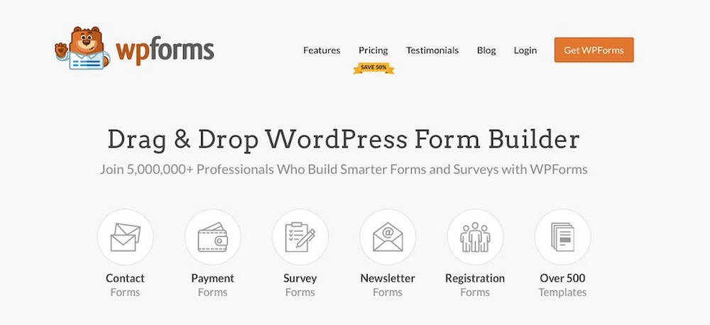
You can also include a contact form for users to easily reach out to you. WPForms is great for creating custom and stylish contact forms.
Overall, including clear contact information on your website can help you build trust
Consider also including links to your social media profiles as an additional way for users to contact you.
17. Not prioritizing site security
Site security is essential for protecting both your business and your users’ personal information.
Neglecting site security can lead to data breaches and loss of customer trust.
For instance, let’s say a website takes credit card payments but isn’t secured with an SSL certificate.
This could mean any personal information entered into the website is sent unencrypted over the web and can easily be intercepted by malicious hackers.
To avoid this, make sure your website has a valid SSL certificate installed to protect user data.
You should also make sure to regularly update your website with the latest security patches and use a unique, strong password to protect the admin panel.
You should also enforce strong passwords for anyone logging into your site and consider two-factor authentication as an extra protection.
In addition, you should consider investing in third-party security solutions like malware scanners and firewalls.
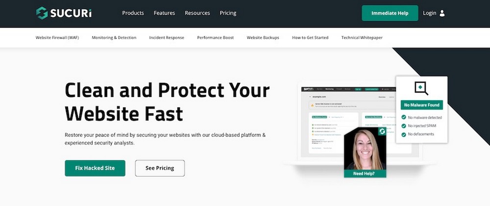
These measures can help keep your website safe from malicious attacks. Sucuri is a great plugin for WordPress websites that offers website security scanning and malware removal.
Or, you might find MalCare more appealing, which offers website security monitoring, malware scanning and removal, and anti-spam services.
By taking the necessary steps to secure your website, you can ensure that your business is protected from malicious attacks and data breaches.
This will also help build customer trust as customers will know their personal information is safe when visiting your site.
Avoid these common web design mistakes and improve your site’s success
By avoiding these common web design mistakes, you can create a website that is visually appealing, easy to navigate, and effective at communicating your message.
A well-designed website can help to build trust with your audience and drive business success.
Remember to keep the user in mind when designing your website, and be sure to test it on different devices to ensure a consistent experience.
And of course, you can help to mitigate some of these design mistakes straight away by using a high quality WordPress theme like Astra.
Astra is a multi-purpose free WordPress theme that includes beautiful layouts and plenty of customization options. It can help you create a website that looks great, loads quickly, and helps to build customer trust.
With careful planning and attention to detail, you can create a website that meets the needs of your business and your users.
Good luck!

Abhijeet Kaldate is the co-founder and CRO of Brainstorm Force. With a keen eye for detail and a knack for getting things done, Abhijeet oversees the company's operations, managing key areas such as HR, marketing, design and finance.
Disclosure: This blog may contain affiliate links. If you make a purchase through one of these links, we may receive a small commission. Read disclosure. Rest assured that we only recommend products that we have personally used and believe will add value to our readers. Thanks for your support!


