
- How To Install the Astra Theme
- System Requirement for Astra Theme
- What Is a Child Theme and How To Install It for Astra?
- Manually Install Astra via FTP
- How to Update Astra Theme Manually?
- Automatic Beta Updates for Astra
- Astra 4.2.0-beta.1 : Migrations & Backwards Compatibility
- Know More about Astra Beta Versions? How to Download and Use?
- How to Create a Multisite Network and Use Astra Child Theme On It
- Getting Started with Astra Pro Addon Plugin
- What is Astra Pro Add on?
- How to Install Astra Pro Plugin?
- How to Get License Key of Astra Pro?
- How to Activate Astra Pro Addon License?
- How to Fix “The Package Could Not Be Installed. The Theme Is Missing the style.css Stylesheet” Error
- Why Can’t I Access Astra Pro Features After Purchasing the Pro Version?
- Do Not See License Activation Form for Astra Pro Addon Plugin?
- How to Fix “Sorry, You Are Not Allowed To Access This Page” Error In Astra Pro
- How to Download Your Purchase Invoice
- How to Manage License on Store?
- How Do License Upgrades Work?
- How To Update Your Payment Method?
- How to Process Refund Requests?
- How to Apply For Brainstorm Force Affiliate Program? (Become Astra Affiliate)
- Frequently Asked Questions – VIP Priority Support
- How do I check my Support Ticket History?
- Global Typography – Astra Theme
- Global Colors – Astra Theme
- Astra Theme Container Layouts
- Full Width – Container Layout
- Narrow Width – Container Layout
- How to Use the Astra Button Presets
- Astra Typography Presets
- Typography Improvement for Astra
- Astra Global Color Palette
- How to use the color palette of the Astra theme
- How to Change Website Background Color in Astra
- How to Change the Typography of the Astra Menu
- Understanding Container Style in Astra Theme: Customizing Your Container’s Look
- Secondary Buttons
- Custom Global Colors
- How To Create a Header With Astra Header Builder
- How To Create Mobile Header With Astra Header Builder
- Why Is My Logo Blurry?
- Astra – Customize the Submenu
- FAQs – Astra Header/Footer Builder
- Elements in Header/Footer Builder With Astra Theme and Astra Pro
- Add Multiple Elements in Header Footer Builder
- FAQs – Astra Header/Footer Builder – Existing Customers
- Clone Elements in Header Footer Builder
- How To Manage Sidebars in Free Astra Theme
- Understanding Sidebar Style in Astra Theme: Customizing Your Sidebar’s Look
- Sticky Sidebar
- Scroll To Top
- How to Display a Breadcrumb Anywhere within a Page or Post with Shortcode?
- Find the Way With Breadcrumbs
- How to Change the “HOME” String in Breadcrumbs
- How to Switch From Existing Breadcrumb to New Trail?
- How To Add Breadcrumbs in WordPress Website with Astra
- Blog Overview
- Blog / Archive
- Single Post
- Display Related Posts on Single Blog Post
- How to remove an Author’s name from a Single Blog Post?
- How to Remove Astra Post Excerpt from the Post Archive
- Show “Last Updated” or “Published Date” on Blog
- The Recommended Size for Featured Image
- How to add a Blog page banner/title with Astra
- How to Keep Accordion Closed for Single Product Description
- How to Change the Heading Tag for WooCommerce Product Titles in Astra
- Astra WooCommerce Mini Cart Shortcode
- WooCommerce Module Overview
- How to Design a Product Catalog Page or Shop Page Using WooCommerce Module in Astra?
- Single Product WooCommerce
- Checkout Page WooCommerce
- Colors & Background Options For WooCommerce
- Typography Options for WooCommerce
- How to Disable EDD Inbuilt Styling?
- How to Add Download Archive Pages to the Menu When Using Astra with EDD?
- How to Add EDD Cart in Header? (Old Astra Header)
- How to Display a Mini Cart Anywhere Using Shortcode? (Astra and EDD)
- EDD – Easy Digital Downloads Module Overview
- General – EDD Module Options
- Product Archive – EDD Module Options
- Single Product – EDD Module Options
- Checkout Page – EDD Module Options
- Footer Custom Text Helper Strings
- How To Disable Right Click in WordPress
- Increasing the PHP Memory Limit of Your Website
- How To Disable Header or Footer for a Landing Page or Post
- Where Does Astra Primary Color Setting Take Effect?
- How To Adjust the Width of Your Sidebar
- How to Update the Plugin Manually from WordPress Backend?
- Recommended Settings for Elementor and the Astra Theme
- Recommended Settings for Beaver Builder and the Astra Theme
- How To Translate Site Builder With WPML?
- How To Make Astra Multilingual With WPML
- How to Translate Astra Strings with WPML?
- Translating the Advanced Custom Fields with WPML
- How to Turn Astra Website Multilingual with Polylang?
- How to Translate Categories, Tags, and Astra Strings with Polylang
- How to Turn Astra Website Multilingual with TranslatePress?
- How to Translate Astra Theme / Plugins in Your Own Language using GlotPress?
- Translate Site Builder Layouts Using Polylang
- Fix for – The PCLZIP_ERR_BAD_FORMAT (-10) Error
- Host Google Fonts Locally – Performance Is the Key
- Fix for – Parse error: syntax error, unexpected T_FUNCTION
- How to fix Fatal Error / White Screen of Death?
- Fix for- cURL error 51: SSL: no alternative certificate subject name matches target host name ‘websitedemos.net’
- ‘The preview could not be loaded’ Pop Up with Astra and Elementor
- Troubleshooting Steps ( with Health Check & Troubleshooting plugin )
- How to Deal with Update Issues in Astra Theme and Astra Pro Addon?
- Blog Featured Image Size Not Working / Error in Image Processing Library
- How to Change the Default Astra Strings
- Using Hooks in Astra
- How to Change the “Scroll To Top” Icon in Astra?
- Astra Pro WP CLI Commands
- How to Add Custom PHP Code?
- How to Disable the Loading of Astra’s Default Font File? (Astra.woff)
- Disable Featured Image on Posts, Pages, or Other Post Types
- Change Sidebar Widget Title Heading Tag
- Disable All Meta Settings of Page or Post by Default
- How to Change Website Logo Destination URL
- Remove Primary Navigation Menu with Hook
- Change the Astra Header Breakpoint Width
- How to Disable Primary Header?
- Add Title attribute to Header Background Image as a Substitute for Alt Text
- How to Change HTML tag for Site Title and Tagline?
- How to Change the Heading Tag for the Page/Post Titles?
- How to Change the “Search Results For” String
- Change Placeholder for Search Box (Old Astra Header)
- How to Change Previous and Next Link Text from a Single Blog Post?
- How to Remove Featured Image Link on Archive Page?
- Filter to Remove Link From Featured Images on Blog Page
- Blog Featured Image Size Not Working / Error in Image Processing Library
- Filters to Support CPTs for Blog Meta and Single Blog Meta
- How To Change Navigation Links Text for a Blog Archive?
- How to Display the Post Category as a Related Posts Title?
- Change “Leave A Comment” title tag
- Customizing Social Profile Links for Individual Authors in Single Posts
- Change Woocommerce Out of Stock Text
- How to Modify/Change the Quick View text?
- Filter to Add Global Button Settings Support for WooCommerce Buttons
- Change the “Shopping Cart” Text for WooCommerce & EDD Mobile Header Cart
- Fix Woocommerce Cart Becoming Transparent With Header Builder
- Restrict Search Results to WooCommerce Products Only
- How To Hide Quantity Number When the Woocommerce Cart Is Empty?
- Remove Astra Customization for WooCommerce
- Remove Woocommerce Product Category Archive Title
- How to Add Custom CSS Code Without Editing Theme Files?
- How to Highlight a Certain Menu Item?
- How to Design Bullets & Lists?
- Dim Content on Menu Hover
- How to add custom CSS and JavaScript to Astra theme
- How To add Custom CSS for Specific Pages
- How to Create Custom CSS using Inspect Element Tool?
- Display Coupon Field on Checkout & Cart Pages
- Always Show Order Summary on Mobile (Astra Modern Checkout)
- Fix Swap Sections Not Working on Mobile (Old Astra Header)
- How to Remove Google Fonts Suggestions in Astra Theme?
- Remove default stretched block layout spacing
- How to Change the Logo on Specific Pages?
- How to remove horizontal & vertical gallery layouts from a single product page?
- Introducing New Filter to Enable/Disable Rank-Math Theme Support
- Enable/Disable YouTube videos from Astra admin dashboard
- How to Fix the Line Height Unit being converted to “EM”?
- How to Change WordPress Post labels to Projects
Custom Global Colors
Astra’s Global Color Palette gives every site 9 theme colors — Brand, Alternate Brand, Headings, Text, four background colors, and one supporting color. Starting with Astra 4.14.0, you can extend the palette with up to 9 custom colors of your own — accent shades, state colors like success or error, category colors, or extra brand tints.
Custom colors behave exactly like the built-in palette colors: they switch along with your palette style, survive preset changes, and show up in every color picker — the Customizer, the WordPress block editor, Elementor’s global colors, and Astra’s meta box settings.
Adding a Custom Color
- From your WordPress dashboard, go to Appearance → Customize → Global → Colors.
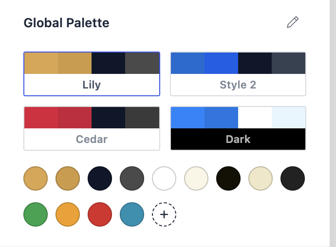
- In the Global Palette section, click the dashed + button at the end of the color swatches.
- A new swatch is added instantly, named Custom 1 and filled with white (
#FFFFFF) as a neutral starting point. - Click the new swatch to open the color picker:
- Type a name for the color in the field at the top (for example, Accent or Success). The name appears everywhere the color is listed — swatch tooltips, the block editor palette, and Elementor.
- Pick the color using the picker or by entering a hex/RGBA value.
- Click Publish to save.
Tip: The name field has no visible border until you focus it with the keyboard — just click into it and type.
One Color, Different Value per Palette Style
Like the 9 theme colors, a custom color is a role that can hold a different value in each palette style. When you add a custom color, the same slot is created in all of your palette styles.
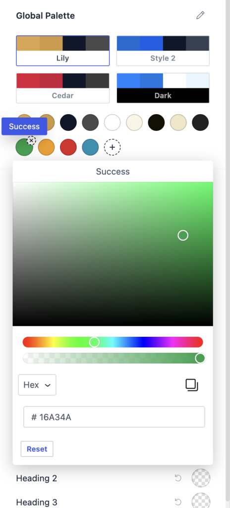
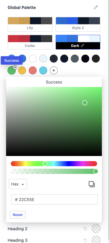
For example, a “Success” color can be a deep green (#16A34A) in your light styles and a brighter green (#22C55E) in your Dark style — switching styles swaps the value automatically, and everything using the color follows along.
To set a per-style value: select the palette style card first, then click the custom swatch and adjust the color. Repeat for each style you want to tune.
Where Custom Colors Appear
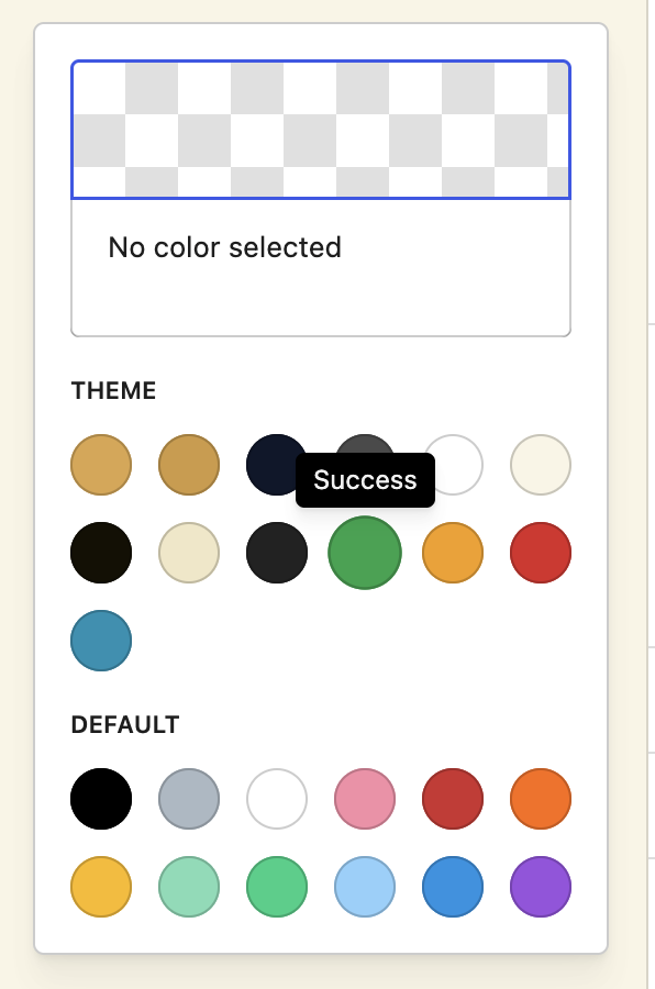
Once published, your custom colors are available — with their names — in:
- Every Astra color option in the Customizer (theme colors, headers, footers, buttons, and so on)
- The WordPress block editor color palette (text, background, and button colors)
- Elementor’s Global Colors panel and widgets (when the global color sync is enabled)
- Astra’s page/post meta box color settings
- The Customizer style guide view
Under the hood, each custom color is a CSS variable — the first custom color is var(--ast-global-color-9), the second var(--ast-global-color-10), and so on. You can use these variables directly in Additional CSS or custom stylesheets.
Renaming or Changing a Custom Color
Click the custom swatch to open its picker — edit the name field or pick a new color at any time. Changes apply live in the preview and everywhere the color is used once you publish.
The Reset button inside a custom color’s picker resets that palette style’s value back to white.
Removing a Custom Color
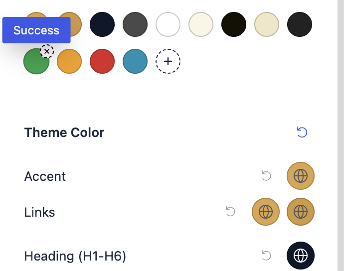
- Hover over the custom swatch — a small × badge appears at its top-right corner.
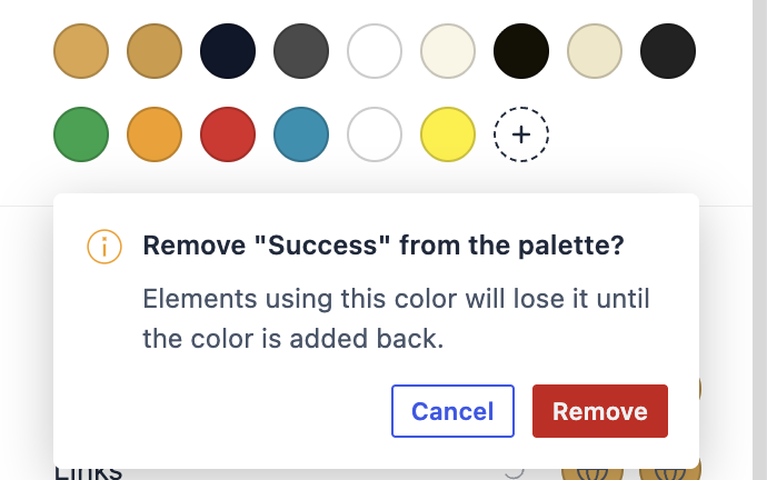
- Click the badge. A confirmation appears: “Remove [name] from the palette?”
- Click Remove to confirm (or Cancel to keep it).
What happens to elements already using the color?
Removing a custom color removes it everywhere — the removal confirmation warns you about this before anything happens:
- The color disappears from all color pickers, the block editor palette, and Elementor’s Global Colors panel.
- Elements still using the color lose it: text falls back to the surrounding text color and backgrounds become transparent, in both the editor and on your site. Nothing breaks structurally, but the styling is gone until the color is added back.
If you only want to change a color everywhere it’s used, edit it instead of removing it — every element using it follows automatically.
Bringing a removed color back
Removal is fully reversible. Click the + button after removing a color and the removed color returns — with the same name and the same values in every palette style — and every element that was using it gets its styling back instantly. If a removal was a mistake, adding the color back is the undo.
New slots are only created once all previously removed colors have been brought back.
Custom Color Limit
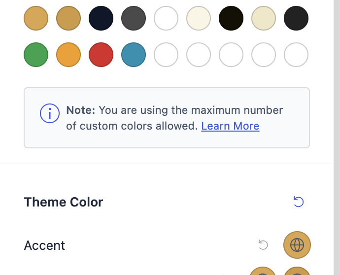
You can add up to 9 custom colors (18 palette colors in total). When you reach the limit, the + button is hidden and a notice appears below the swatches:
Note: You are using the maximum number of custom colors allowed. Learn More
Frequently Asked Questions
Do custom colors work with palette presets (Oak, Lily, Cedar, …)? Yes. Applying a preset only changes the 9 theme colors — your custom colors are left untouched.
Do custom colors survive a theme update? Yes. They are stored in your site’s settings, not in theme files.
Are custom colors included when I import a Starter Template? No — importing a full Starter Template replaces the color palette entirely, including custom colors.
Can editors translate custom color names? Custom color names are your own content (like a post title), so they are shown exactly as you typed them and are not translated.
For Developers
Raising or lowering the custom color limit
The default limit of 9 custom colors can be changed with the astra_global_palette_custom_colors_limit filter:
/**
 * Allow up to 12 custom global colors in the Astra palette.
 */
add_filter( 'astra_global_palette_custom_colors_limit', function () {
    return 12;
} );
Notes:
- The limit is enforced both in the Customizer UI (the + button hides at the cap) and server-side on save.
- Each custom color adds a small amount of inline CSS on every page (the
:rootvariable plus the block editor.has-*-color/.has-*-background-colorclass rules), which is why the default cap is conservative. - Lowering the limit below the number of colors a site already has does not delete existing colors — it only prevents adding new ones.
Useful reference
| What | Value |
| CSS variable for custom slot n | --ast-global-color-{9 + n} (zero-based) |
| Block editor slug | ast-global-color-{9 + n} |
| Elementor global id | astglobalcolor{9 + n} |
| Storage | astra-color-palettes option → customColors array + slots 9+ of each palettes.palette_N array |
| Limit filter | astra_global_palette_custom_colors_limit (default 9) |
Example of the CSS Astra emits on the front end for a palette with four custom colors (taken from a live site):
:root {
    --ast-global-color-0: #DCA54A;  /* Brand */
    /* … theme slots 1-8 … */
    --ast-global-color-9: #16A34A;  /* Success */
    --ast-global-color-10: #F59E0B; /* Warning */
    --ast-global-color-11: #DC2626; /* Error */
    --ast-global-color-12: #0891B2; /* Info */
}
Each active custom slot also gets the block editor color classes on the front end — .has-ast-global-color-9-color and .has-ast-global-color-9-background-color — so editor-assigned colors keep working like any theme color. Removed colors stop emitting their variable and classes entirely until they are added back.
We don't respond to the article feedback, we use it to improve our support content.