
- How To Install the Astra Theme
- System Requirement for Astra Theme
- What Is a Child Theme and How To Install It for Astra?
- Manually Install Astra via FTP
- How to Update Astra Theme Manually?
- Automatic Beta Updates for Astra
- Astra 4.2.0-beta.1 : Migrations & Backwards Compatibility
- Know More about Astra Beta Versions? How to Download and Use?
- How to Create a Multisite Network and Use Astra Child Theme On It
- Getting Started with Astra Pro Addon Plugin
- What is Astra Pro Add on?
- How to Install Astra Pro Plugin?
- How to Get License Key of Astra Pro?
- How to Activate Astra Pro Addon License?
- Getting error – The package could not be installed. The theme is missing the style.css stylesheet?
- Why Can’t I Access Astra Pro Features After Purchasing the Pro Version?
- Do Not See License Activation Form for Astra Pro Addon Plugin?
- How to Fix “Sorry, You Are Not Allowed To Access This Page” Error In Astra Pro
- How to Download Your Purchase Invoice
- How to Manage License on Store?
- How Do License Upgrades Work?
- How To Update Your Payment Method?
- How to Process Refund Requests?
- How to Apply For Brainstorm Force Affiliate Program? (Become Astra Affiliate)
- Frequently Asked Questions – VIP Priority Support
- How do I check my Support Ticket History?
- How To Create a Header With Astra Header Builder
- How To Create Mobile Header With Astra Header Builder
- Why Is My Logo Blurry?
- Astra – Customize the Submenu
- FAQs – Astra Header/Footer Builder
- Elements in Header/Footer Builder With Astra Theme and Astra Pro
- Add Multiple Elements in Header Footer Builder
- FAQs – Astra Header/Footer Builder – Existing Customers
- Clone Elements in Header Footer Builder
- Using Language Switcher Element with WPML
- Toggle Button for Desktop – Header Builder Element
- Manage Your Site Identity With Astra’s Header Builder
- How To Create a Header With a Centrally Positioned Logo With Astra
- Stick Footer to the Bottom When Page Content is Less
- Footer Widgets Module with Astra Pro
- How To Fix Right Margin for the Footer Widget Element
- Creating Your Header and Footer With Astra or Elementor?
- Transparent Header for HFB
- How to Create a Mobile Menu
- How To Design Footer Background in Astra
- How To Highlight the Active Menu Item
- How To Disable Logo Cropping
- How to Activate Live Search
- How to Use WhatsApp Social Icon Effectively
- Header Presets
- Logo SVG Icon
- How To Create a Footer With Astra Footer Builder
- How To Manage Sidebars in Free Astra Theme
- Understanding Sidebar Style in Astra Theme: Customizing Your Sidebar’s Look
- Sticky Sidebar
- Scroll To Top
- How to Display a Breadcrumb Anywhere within a Page or Post with Shortcode?
- Find the Way With Breadcrumbs
- How to Change the “HOME” String in Breadcrumbs
- How to Switch From Existing Breadcrumb to New Trail?
- How To Add Breadcrumbs in WordPress Website with Astra
- Blog Overview
- Blog / Archive
- Single Post
- Display Related Posts on Single Blog Post
- How to remove an Author’s name from a Single Blog Post?
- How to Remove Astra Post Excerpt from the Post Archive
- Show “Last Updated” or “Published Date” on Blog
- The Recommended Size for Featured Image
- How to add a Blog page banner/title with Astra
- How to Keep Accordion Closed for Single Product Description
- How to Change the Heading Tag for WooCommerce Product Titles in Astra
- Astra WooCommerce Mini Cart Shortcode
- WooCommerce Module Overview
- How to Design a Product Catalog Page or Shop Page Using WooCommerce Module in Astra?
- Single Product WooCommerce
- Checkout Page WooCommerce
- Colors & Background Options For WooCommerce
- Typography Options for WooCommerce
- How to Disable EDD Inbuilt Styling?
- How to Add Download Archive Pages to the Menu When Using Astra with EDD?
- How to Add EDD Cart in Header? (Old Astra Header)
- How to Display a Mini Cart Anywhere Using Shortcode? (Astra and EDD)
- EDD – Easy Digital Downloads Module Overview
- General – EDD Module Options
- Product Archive – EDD Module Options
- Single Product – EDD Module Options
- Checkout Page – EDD Module Options
- Footer Custom Text Helper Strings
- How To Disable Right Click in WordPress
- Increasing the PHP Memory Limit of Your Website
- How To Disable Header or Footer for a Landing Page or Post
- Where Does Astra Primary Color Setting Take Effect?
- How To Adjust the Width of Your Sidebar
- How to Update the Plugin Manually from WordPress Backend?
- Recommended Settings for Elementor and the Astra Theme
- Recommended Settings for Beaver Builder and the Astra Theme
- How To Translate Site Builder With WPML?
- How To Make Astra Multilingual With WPML
- How to Translate Astra Strings with WPML?
- Translating the Advanced Custom Fields with WPML
- How to Turn Astra Website Multilingual with Polylang?
- How to Translate Categories, Tags, and Astra Strings with Polylang
- How to Turn Astra Website Multilingual with TranslatePress?
- How to Translate Astra Theme / Plugins in Your Own Language using GlotPress?
- Translate Site Builder Layouts Using Polylang
- Fix for – The PCLZIP_ERR_BAD_FORMAT (-10) Error
- Host Google Fonts Locally – Performance Is the Key
- Fix for – Parse error: syntax error, unexpected T_FUNCTION
- How to fix Fatal Error / White Screen of Death?
- Fix for- cURL error 51: SSL: no alternative certificate subject name matches target host name ‘websitedemos.net’
- ‘The preview could not be loaded’ Pop Up with Astra and Elementor
- Troubleshooting Steps ( with Health Check & Troubleshooting plugin )
- How to Deal with Update Issues in Astra Theme and Astra Pro Addon?
- Blog Featured Image Size Not Working / Error in Image Processing Library
- How to Change the Default Astra Strings
- Using Hooks in Astra
- How to Change the “Scroll To Top” Icon in Astra?
- Astra Pro WP CLI Commands
- How to Add Custom PHP Code?
- How to Disable the Loading of Astra’s Default Font File? (Astra.woff)
- Disable Featured Image on Posts, Pages, or Other Post Types
- Change Sidebar Widget Title Heading Tag
- Disable All Meta Settings of Page or Post by Default
- How to Change Website Logo Destination URL
- Remove Primary Navigation Menu with Hook
- Change the Astra Header Breakpoint Width
- How to Disable Primary Header?
- Add Title attribute to Header Background Image as a Substitute for Alt Text
- How to Change HTML tag for Site Title and Tagline?
- How to Change the Heading Tag for the Page/Post Titles?
- How to Change the “Search Results For” String
- Change Placeholder for Search Box (Old Astra Header)
- How to Change Previous and Next Link Text from a Single Blog Post?
- How to Remove Featured Image Link on Archive Page?
- Filter to Remove Link From Featured Images on Blog Page
- Blog Featured Image Size Not Working / Error in Image Processing Library
- Filters to Support CPTs for Blog Meta and Single Blog Meta
- How To Change Navigation Links Text for a Blog Archive?
- How to Display the Post Category as a Related Posts Title?
- Change “Leave A Comment” title tag
- Customizing Social Profile Links for Individual Authors in Single Posts
- Change Woocommerce Out of Stock Text
- How to Modify/Change the Quick View text?
- Filter to Add Global Button Settings Support for WooCommerce Buttons
- Change the “Shopping Cart” Text for WooCommerce & EDD Mobile Header Cart
- Fix Woocommerce Cart Becoming Transparent With Header Builder
- Restrict Search Results to WooCommerce Products Only
- How To Hide Quantity Number When the Woocommerce Cart Is Empty?
- Remove Astra Customization for WooCommerce
- Remove Woocommerce Product Category Archive Title
- How to Add Custom CSS Code Without Editing Theme Files?
- How to Highlight a Certain Menu Item?
- How to Design Bullets & Lists?
- Dim Content on Menu Hover
- How to add custom CSS and JavaScript to Astra theme
- How To add Custom CSS for Specific Pages
- How to Create Custom CSS using Inspect Element Tool?
- Display Coupon Field on Checkout & Cart Pages
- Always Show Order Summary on Mobile (Astra Modern Checkout)
- Fix Swap Sections Not Working on Mobile (Old Astra Header)
- How to Remove Google Fonts Suggestions in Astra Theme?
- Remove default stretched block layout spacing
- How to Change the Logo on Specific Pages?
- How to remove horizontal & vertical gallery layouts from a single product page?
- Introducing New Filter to Enable/Disable Rank-Math Theme Support
- Enable/Disable YouTube videos from Astra admin dashboard
- How to Fix the Line Height Unit being converted to “EM”?
- How to Change WordPress Post labels to Projects
Toggle Button for Desktop – Header Builder Element
The Toggle Button lets you tuck extra content — like a menu, a search bar, a button, or social icons — behind a small button in your desktop header. When a visitor clicks it, that content slides out in an ‘off-canvas’ panel, similar to how the hamburger menu works on mobile.
This is a great option when your header feels crowded, but you still want quick access to things like a search box, secondary menu, or contact button.
When a user clicks on the toggle button, it brings an off-canvas window on the screen with all the content you added inside.
As it needs a small space in the header, this is a great way to display content in the header.
This is a premium feature. You’ll need Astra Pro (version 3.3 or later) activated on your site, along with the Astra theme. Before version 3.3, adding a toggle button on desktop required custom code — with this element, no code is needed.
Now you can easily display off-canvas content on desktop and customize it completely with the new Toggle Button element.
Here is a video that explains how to use this element:
If you prefer a written version, let us dive in!
How To Add Toggle Button for Desktop
As this is a premium feature, before you start, make sure you have:
- The Astra theme installed and active
- The Astra Pro plugin installed, activated, and updated to version 3.3 or later
- A valid Astra Pro license (needed for updates and support).
Step 1: Add the Toggle Button to Your Header
- Go to Appearance → Customize → Header (or open the Header Builder from wherever you usually access it).
- Click on the header section where you’d like the toggle button to appear (left, center, or right).
- From the list of elements, select Toggle Button.
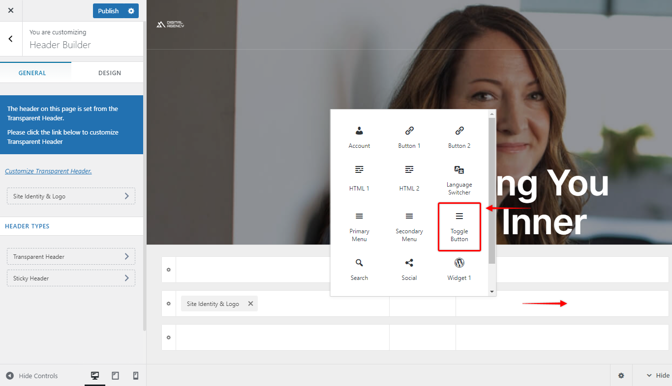
Step 2: Choose What Appears in the Off-Canvas Panel
Once you’ve added the Toggle Button, an Off-Canvas section will automatically appear in the Header Builder. This is where you decide what content shows up when someone clicks the button.
- Click on the Off-Canvas section.
- A list of available elements will open — choose any of the following: Buttons, Search, Widgets, HTML, Social Icons, Off-Canvas Menu, and more.
Selected elements are added automatically to the panel. To customize any of them (colors, text, spacing, etc.), just click on that element and its settings will open in the Customizer.”
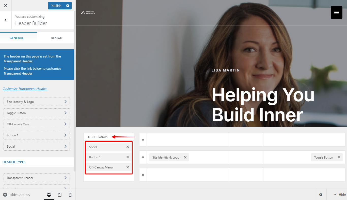
Important — Adding a Menu:
If you want a navigation menu inside the off-canvas panel, use the Off-Canvas Menu element specifically. The regular Primary and Secondary Menu elements will not display correctly inside this panel.
By default, the Off-Canvas Menu shows every published page on your site (like WordPress’s default menu behavior). If you’d like it to show a specific set of links instead, you’ll need to either create a new menu or assign one of your existing menus to it.”
If you are not sure how to create and assign off-canvas menu, here are the steps –
1. Click on the Off-Canvas Menu element.
2. In the Customizer panel, click Configure Menu from Here.
3. Under the Off-Canvas Menu dropdown, select the menu you want to use.
4. Don’t have one yet? Click Create New Menu and it will automatically be assigned as your off-canvas menu.
Important — Adding a Menu:
If you want a navigation menu inside the off-canvas panel, use the Off-Canvas Menu element specifically. The regular Primary and Secondary Menu elements will not display correctly inside this panel.
By default, the Off-Canvas Menu shows every published page on your site (like WordPress’s default menu behavior). If you’d like it to show a specific set of links instead, you’ll need to either create a new menu or assign one of your existing menus to it.”
Step 3: Design the Toggle Button
With your off-canvas content in place, you can now style the button itself.
Its settings will open in the Customizer.
Click directly on the toggle button in the Header Builder.
To customize the toggle button, click on the button in the header builder and all design options will promptly open in the customizer.
Under the General tab, you can set:
| Option | What it does |
|---|---|
| Icon | Choose from three built-in icon styles |
| Toggle Button Style | Pick from three pre-built button designs |
| Menu Label | Add a text label next to the icon (optional) |
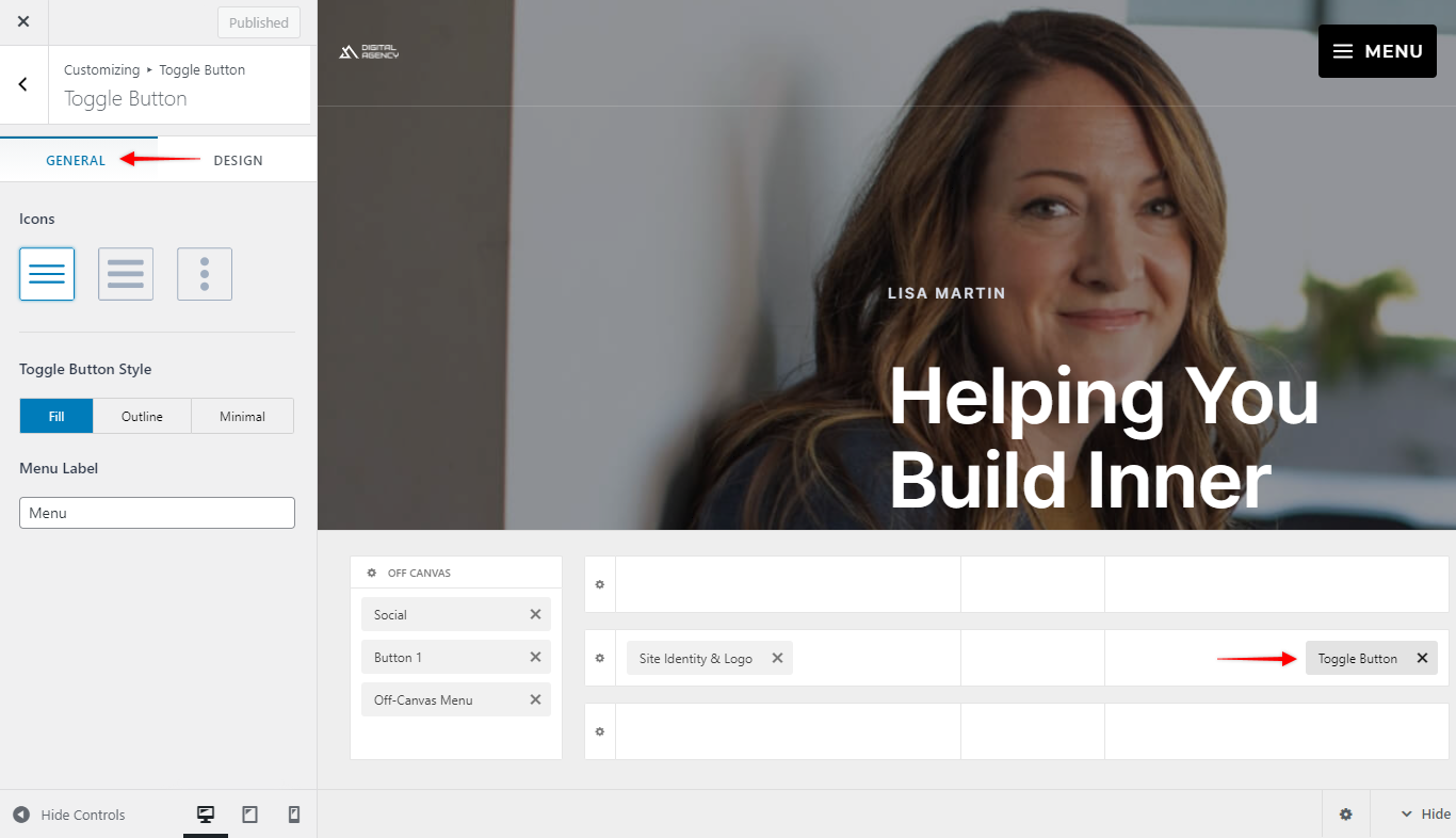
Under the Design tab, you can adjust: Size, Color, Margin/spacing”
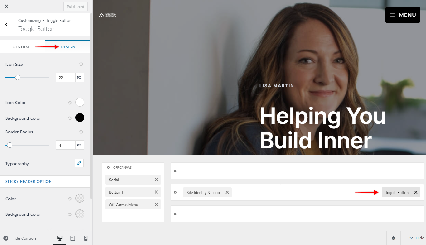
Step 4: Design the Off-Canvas Panel
Finally, style the panel that appears when the button is clicked.
Its options will open in the Customizer.
Click the gear/settings icon next to the Off-Canvas section in the Header Builder.
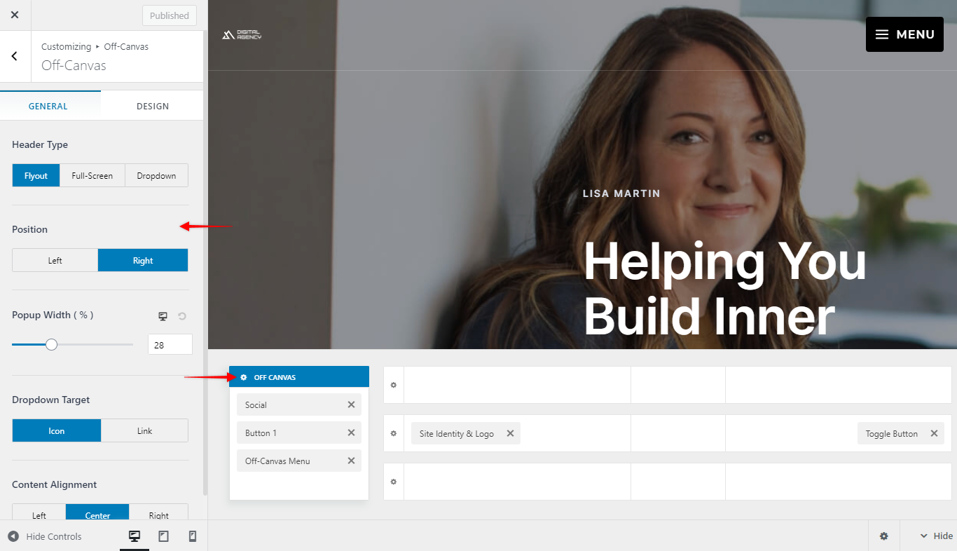
Under the General tab, you can set the panel type and its position (left, right, etc.).
Under the Design tab, you can set colors and spacing.
Desktop, tablet, and mobile are independent. If you switch device previews in the Customizer, you’ll notice the off-canvas section still appears — but it does not automatically carry over your desktop settings. Each device (desktop, tablet, mobile) has its own separate toggle/off-canvas setup, so you can design a completely different experience for each one if you’d like.
Still Need a Hand?
If something isn’t working as expected, our support team is happy to take a closer look — just reach out via Contact Support with your site URL and a quick description of what you’re seeing.
We don't respond to the article feedback, we use it to improve our support content.